
About
Classical Caliber Combat Contest is the “kart racer of arena shooters” where old-school movement and weapons meet party game elements like stage hazards, comeback items and a cast of challenging NPC bots.
I worked primarily as our team’s level designer, working on creating distinct dynamic arenas for players to duke it out in. I also worked as a game designer, helping with the creation, balancing, and implementation of many weapons within the game.
Development Info
– Project Type: Game
– Role: Level Designer & Game Designer
– Tools Used: Unreal Engine, Unreal Engine CubeGrid, Photoshop, Obsidian
– Team Size: 3
– Project Length: In-Progress
Game Info
– Genre: Arena FPS/Party Game
– Platform: PC
– Current Status: In-Development
Summary of Contributions
– Designed, Implemented, Decorated, and Lit 8 PVP maps and 1 Lobby area.
– Aided with the implementation, design, and balance of 30+ weapons.
– Aided with the design process for various game systems, notably C4’s Contest Mode.
NAVIGATION
Read on for more in-depth details for each level. The buttons below will take you directly to their section!
Level Design
C4’s Level Design
-
 Playhouse


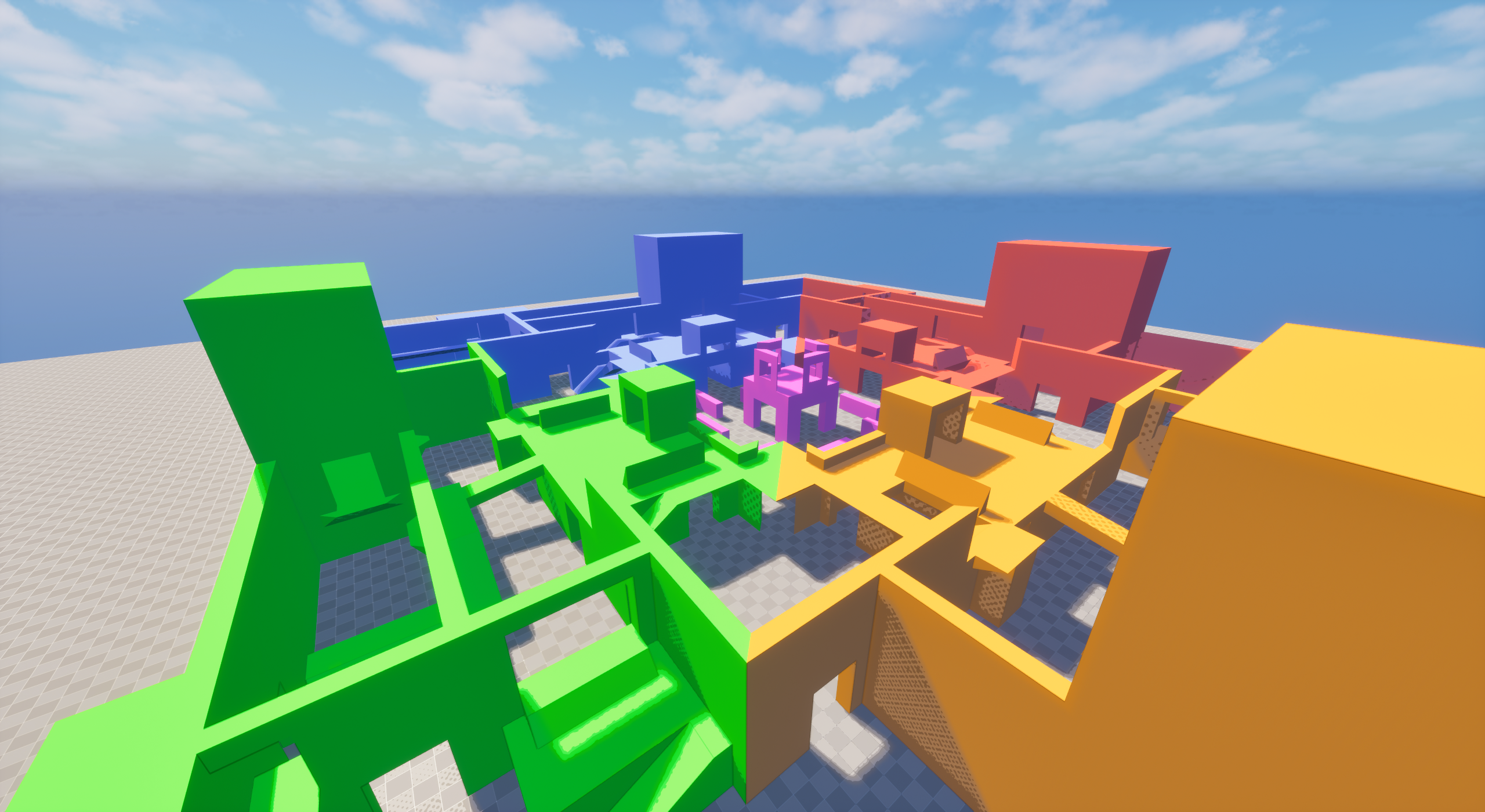
Levels in C4 are an incredibly key part of the play experience due to the game’s reliance on players collecting pickups from the map. They also each will dynamically change in size depending on match settings or lobby size, so them being divisible is also an important feature.
On top of these attributes, maps also needed to follow the Red/Orange/Green/Blue color scheme, and be designed in such a way they flow with both FFA game-modes as well as Team based ones.
Design Process
My main goal when establishing maps for C4 was to make them distinct. We had set for ourselves a hard limit of 8 maps, and I wanted to ensure that each offered a different experience. I started by listing down any type of environment, arena style, or general theme I could think of. From that list, I’d cross out anything adjacent to existing maps, and work from there. A few maps were themes requested by the Lead Designer, but I still followed this process when working on the layout of said maps and how they would play.
The other key part of this design process was keeping in mind maps needing to change in size. Certain designs simply wouldn’t mesh well with smaller or bigger maps, so every map constantly had me planning out how I was going to divide it, and tweaking it if I felt something would be hard to work around.
-
 XL Layout


Overview
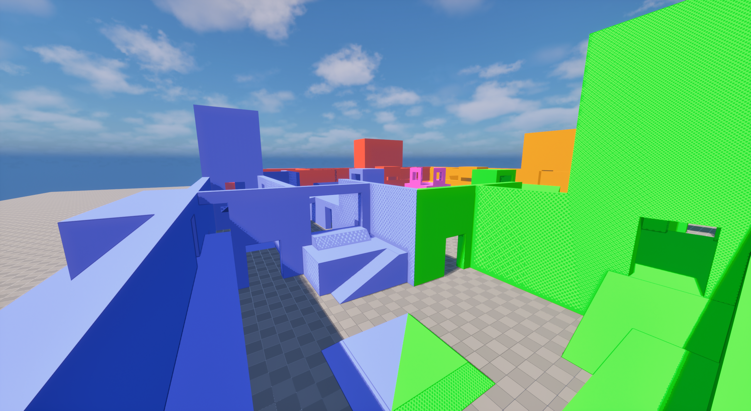
Unlike the other maps, Playhouse pre-dated me joining the C4 development team, so my work regarding its layout was limited.
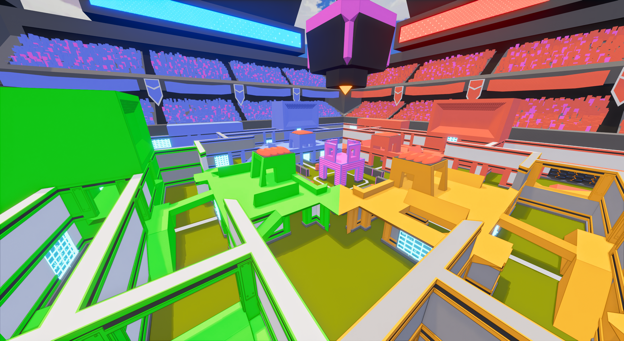
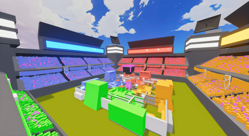
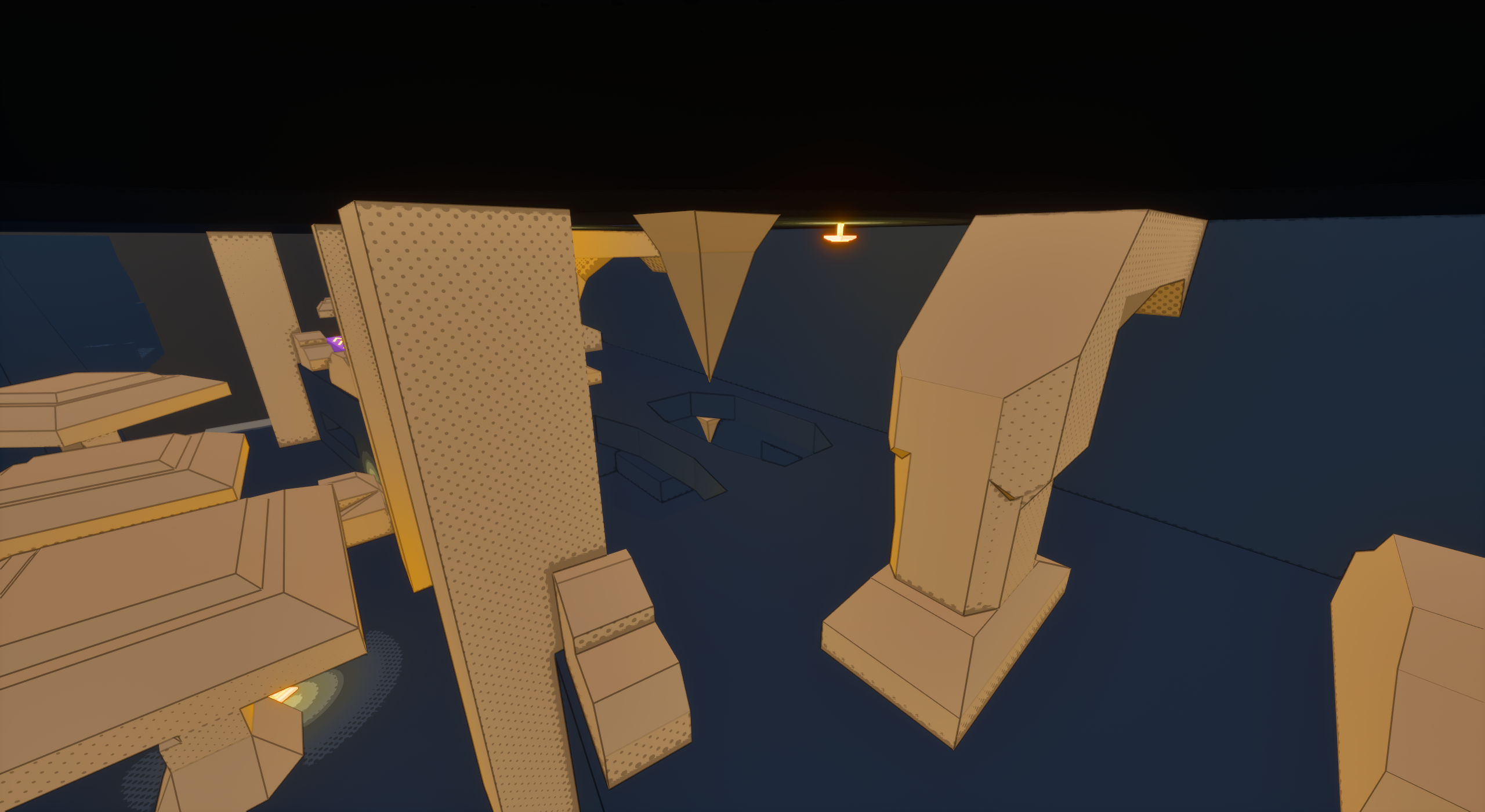
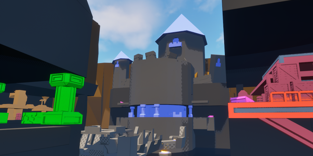
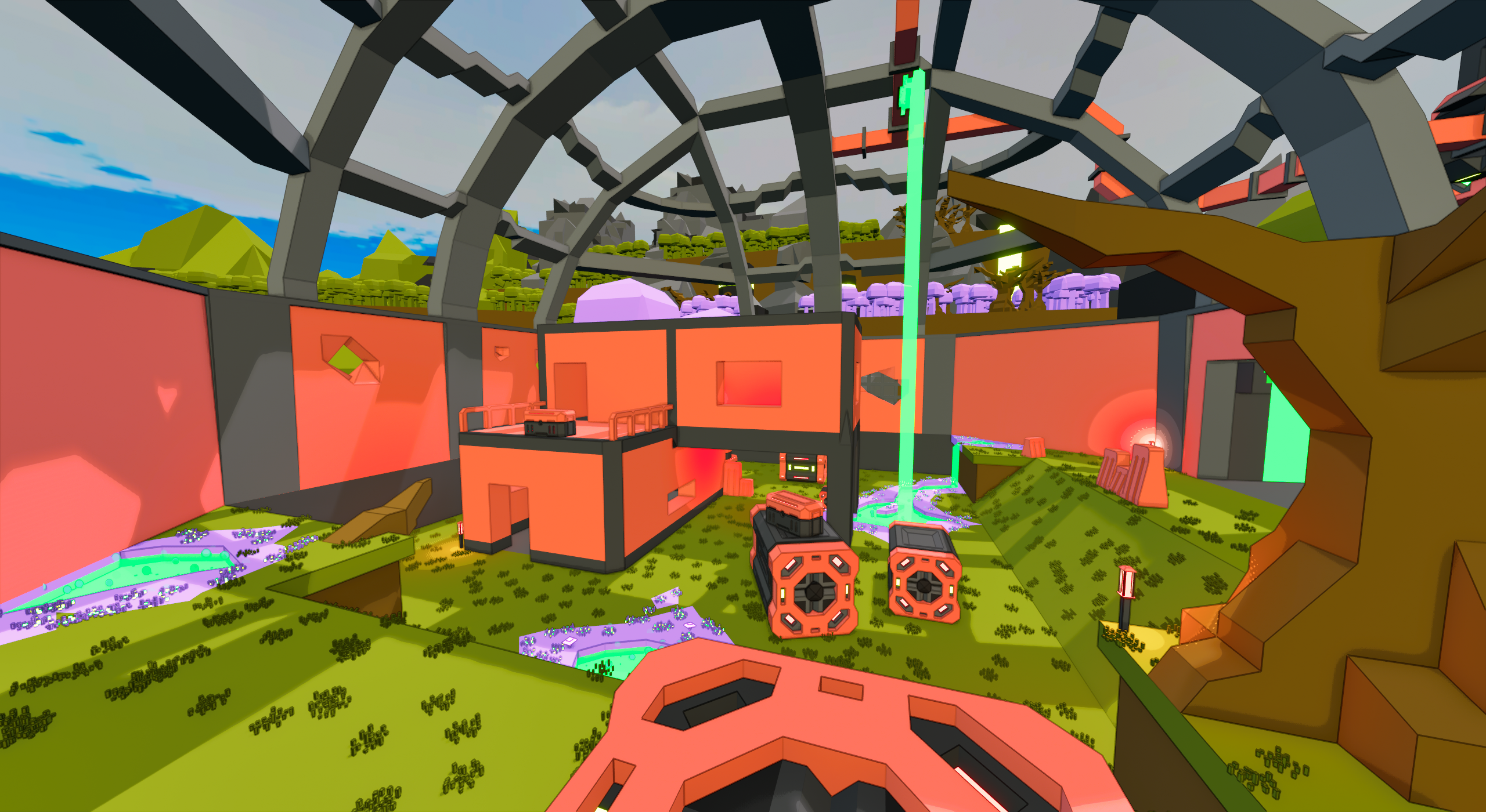
Playhouse takes place in a giant stadium, embodying the exciting competitive spirit commonly found in such places.
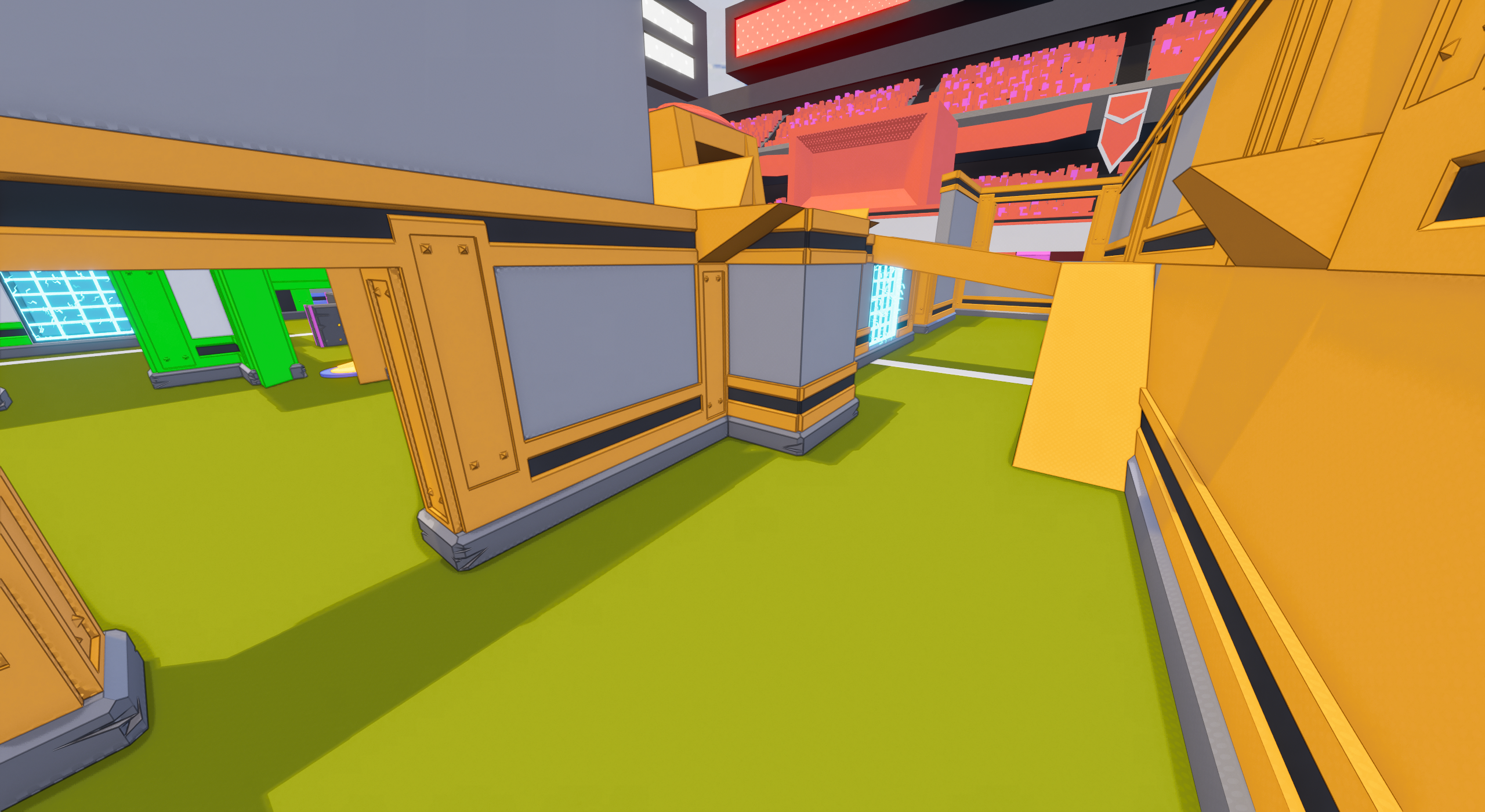
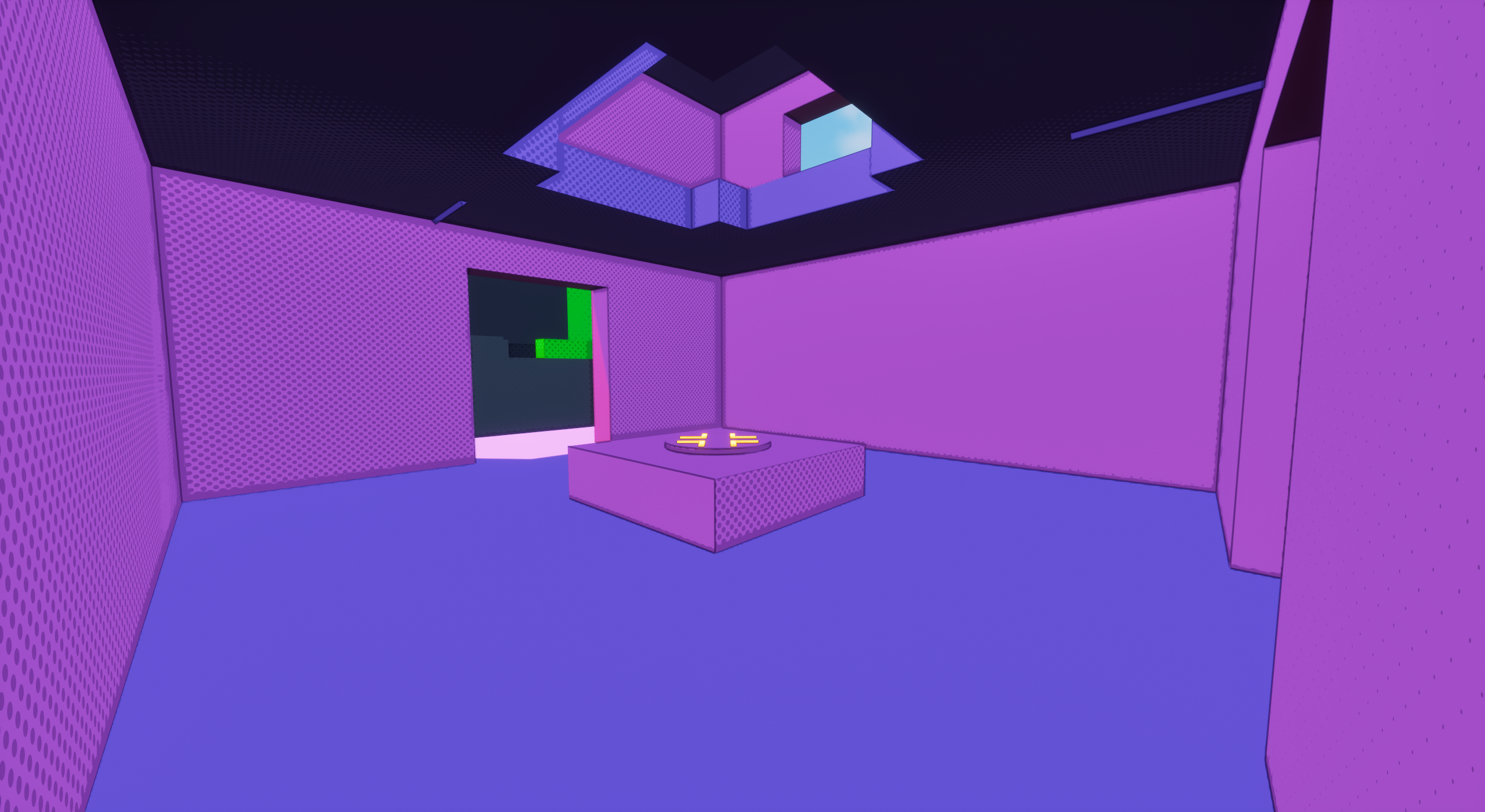
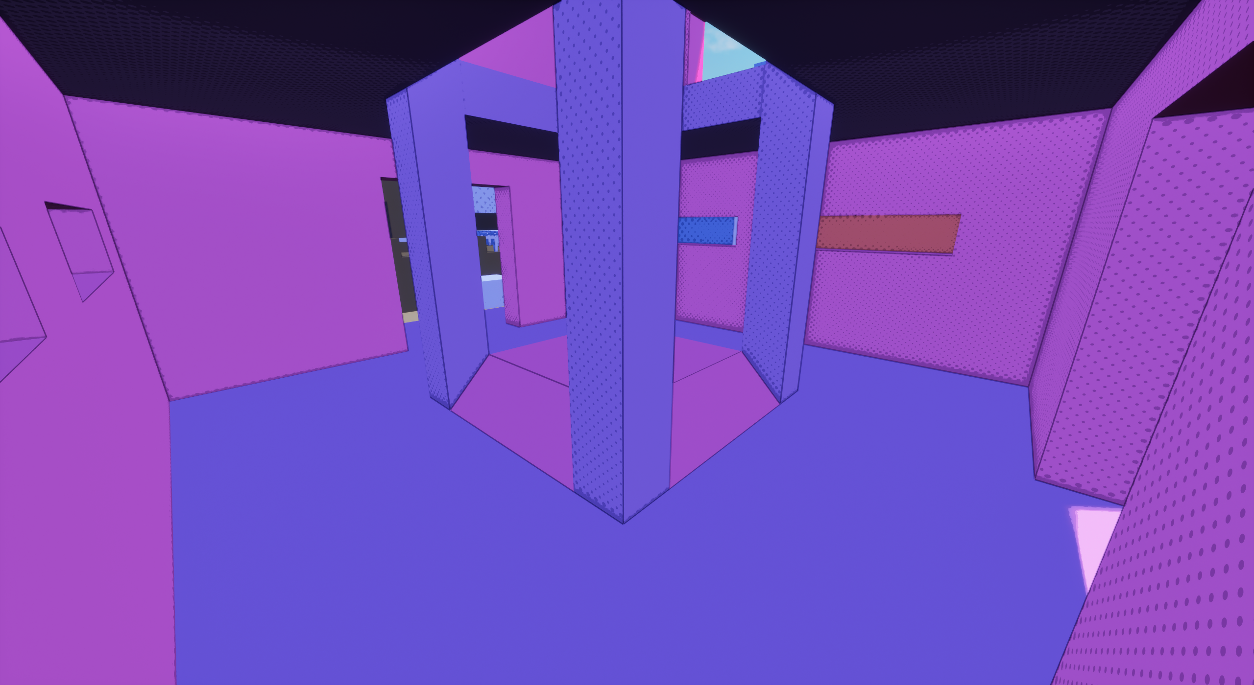
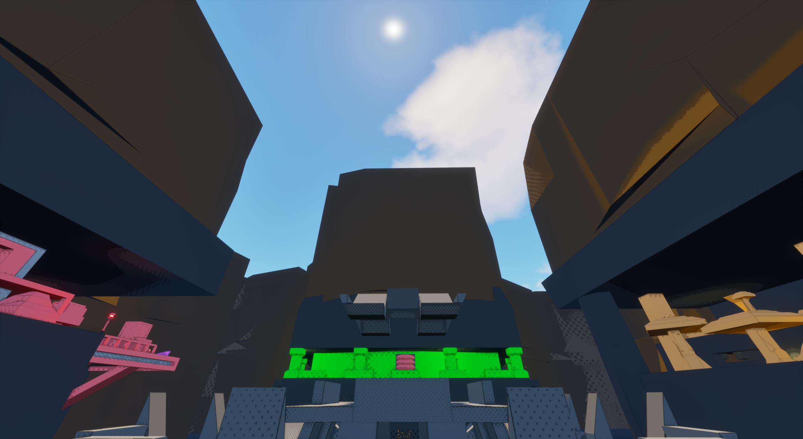
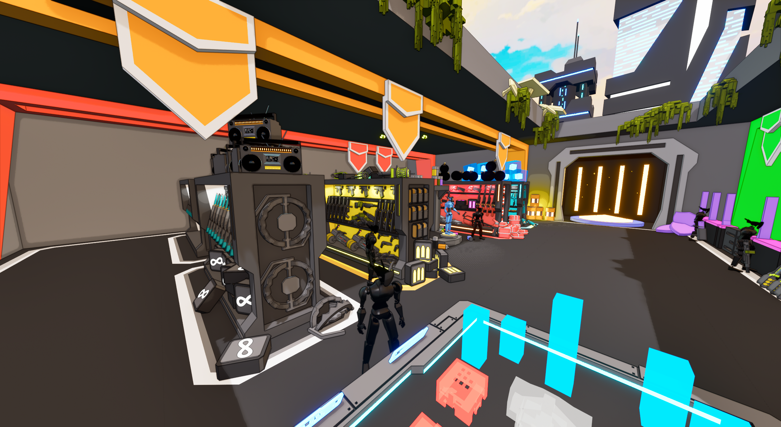
Offering a variety of interconnected rooms and hallways, Playhouse gives a pretty good close and mid-range combat map, giving a wide variety of cover and arenas for players to fight around. Most notably, there is a small tower structure in the center of the map, surrounded by very little cover, but always filled with some strong pickups.
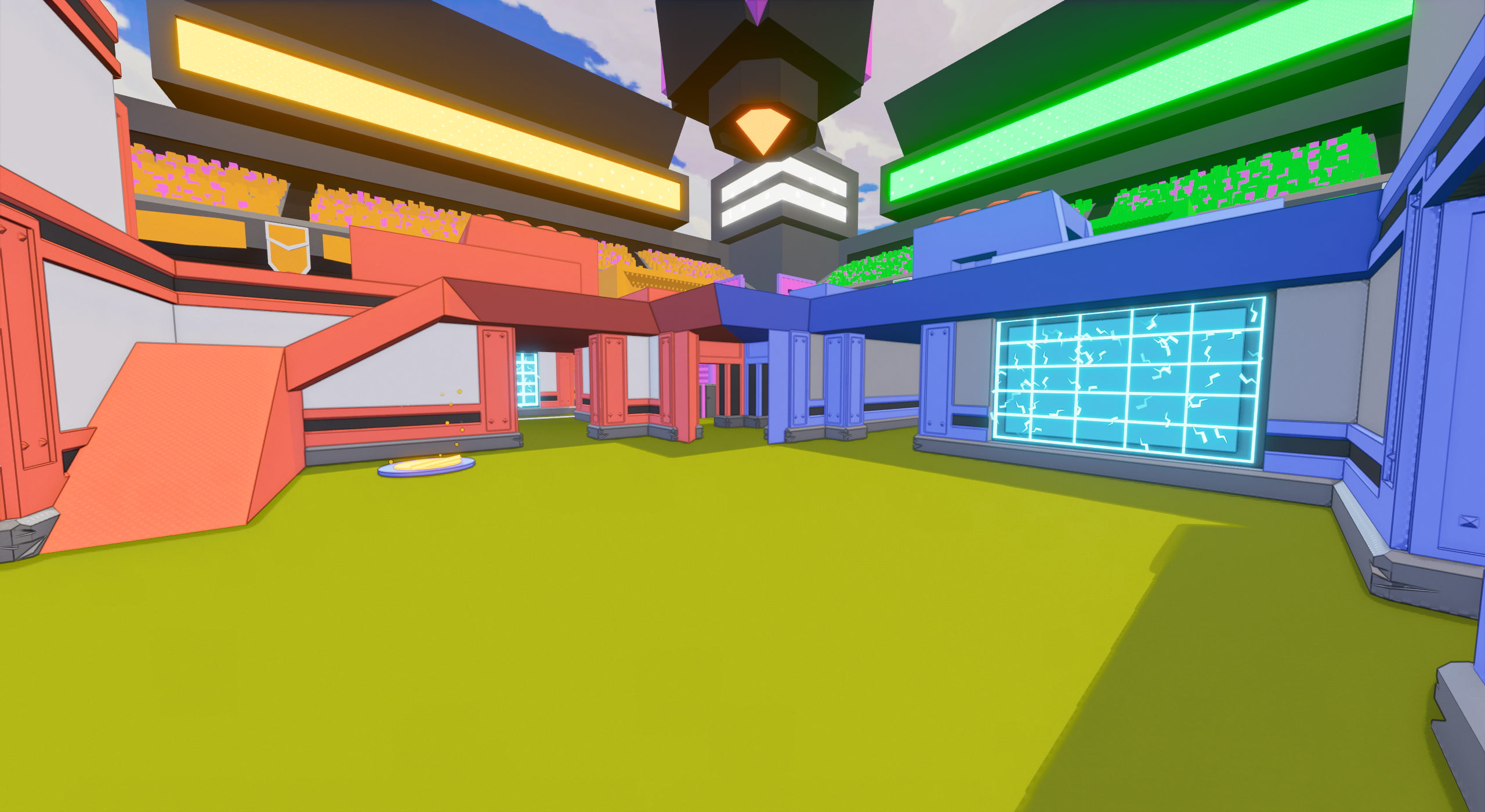
An arena space found close to the middle of Playhouse.
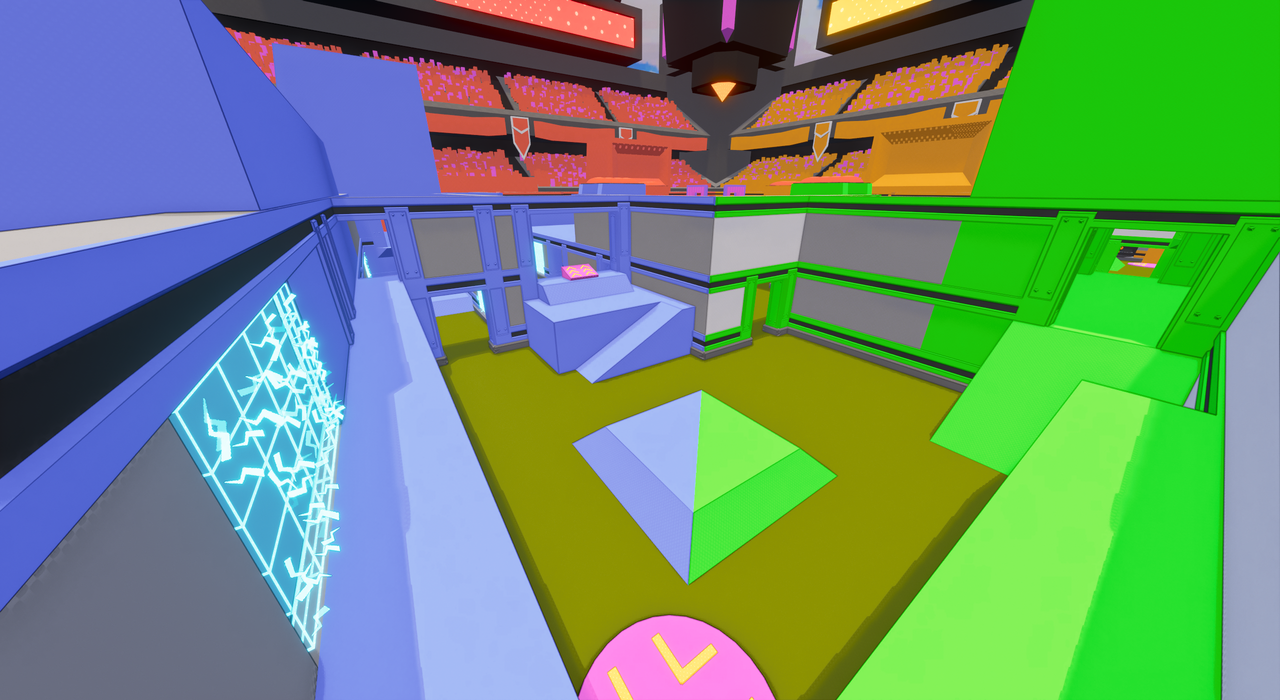
An arena space found on the edges of Playhouse’s XL layout.

Playhouse’s Preview Image.
Looking up from the center of Playhouse.
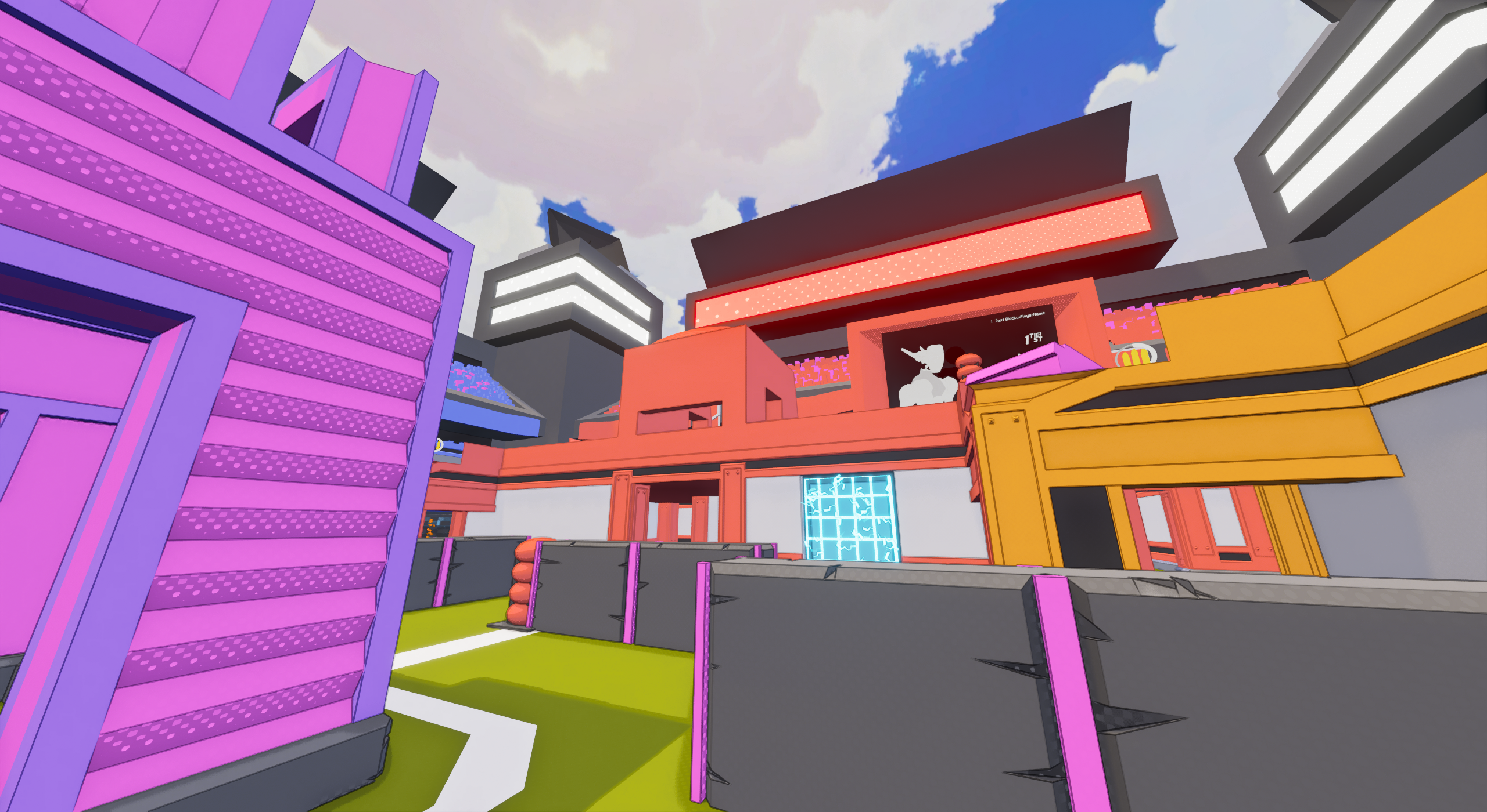
A popular traversal corridor around Playhouse.
Visual Overhaul
My time to work on Playhouse came when preparing for C4’s first demo release, as existing maps each got a visual overhaul. Playhouse desperately needed visual work, as where other maps had been getting incremental detailing, it was still very much the alpha-testing map.
I also took the time to work in some minor layout tweaks based on how the map flowed to encourage the usage of some typically avoided areas. The primary culprit was small bunkers on the second floor platforms facing the middle. These functioned as dead ends and nobody would ever wander inside. So, I extended the walls and gave them some doorways, incorporating them into the circular flow of the map.
A variety of stage hazards also got added to the map, as it had predated the creation of those as well.

Overview
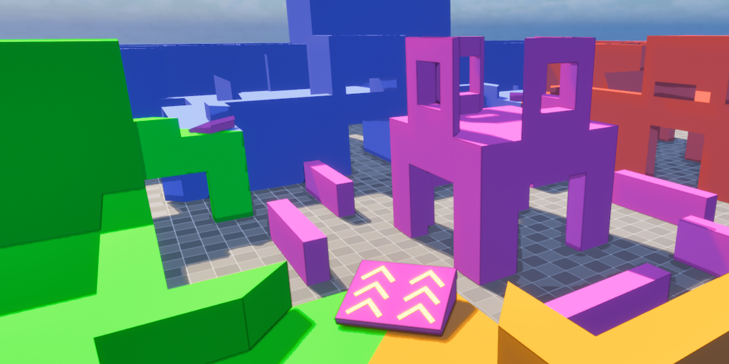
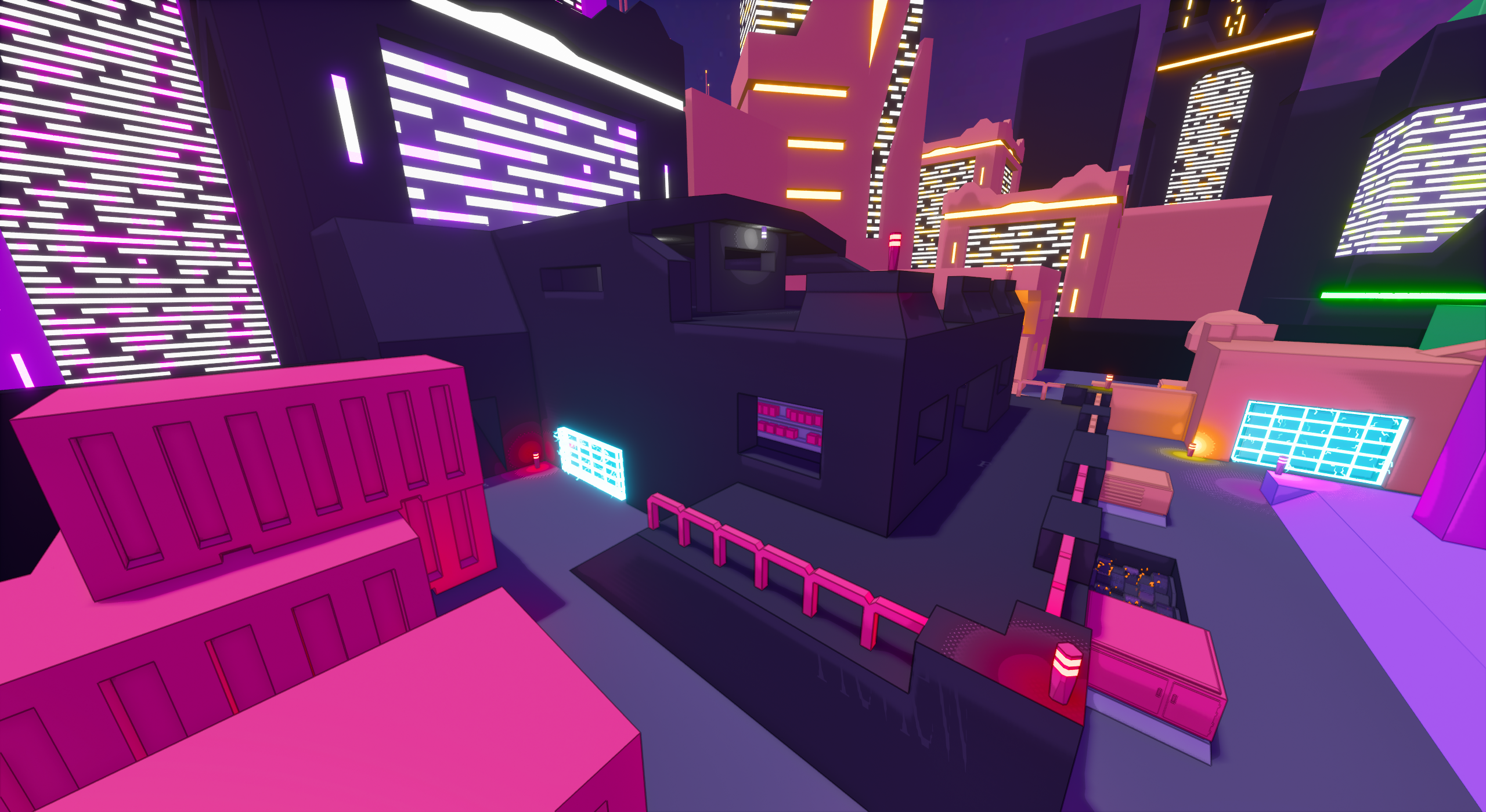
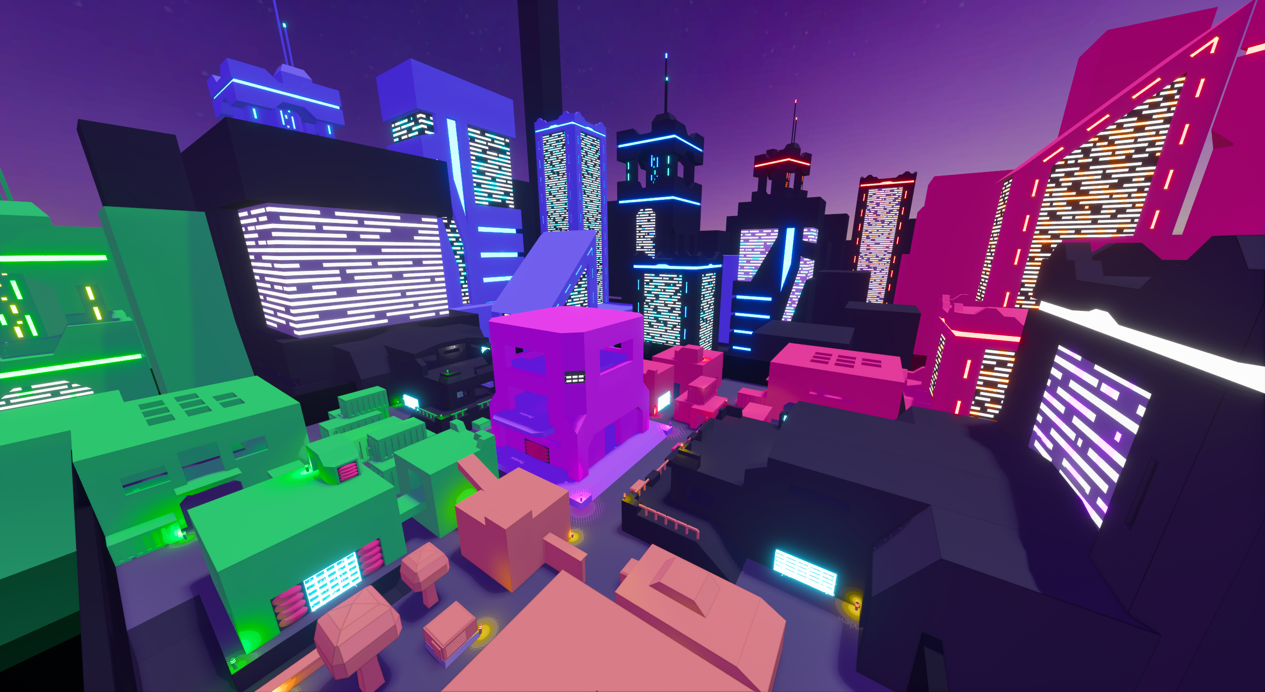
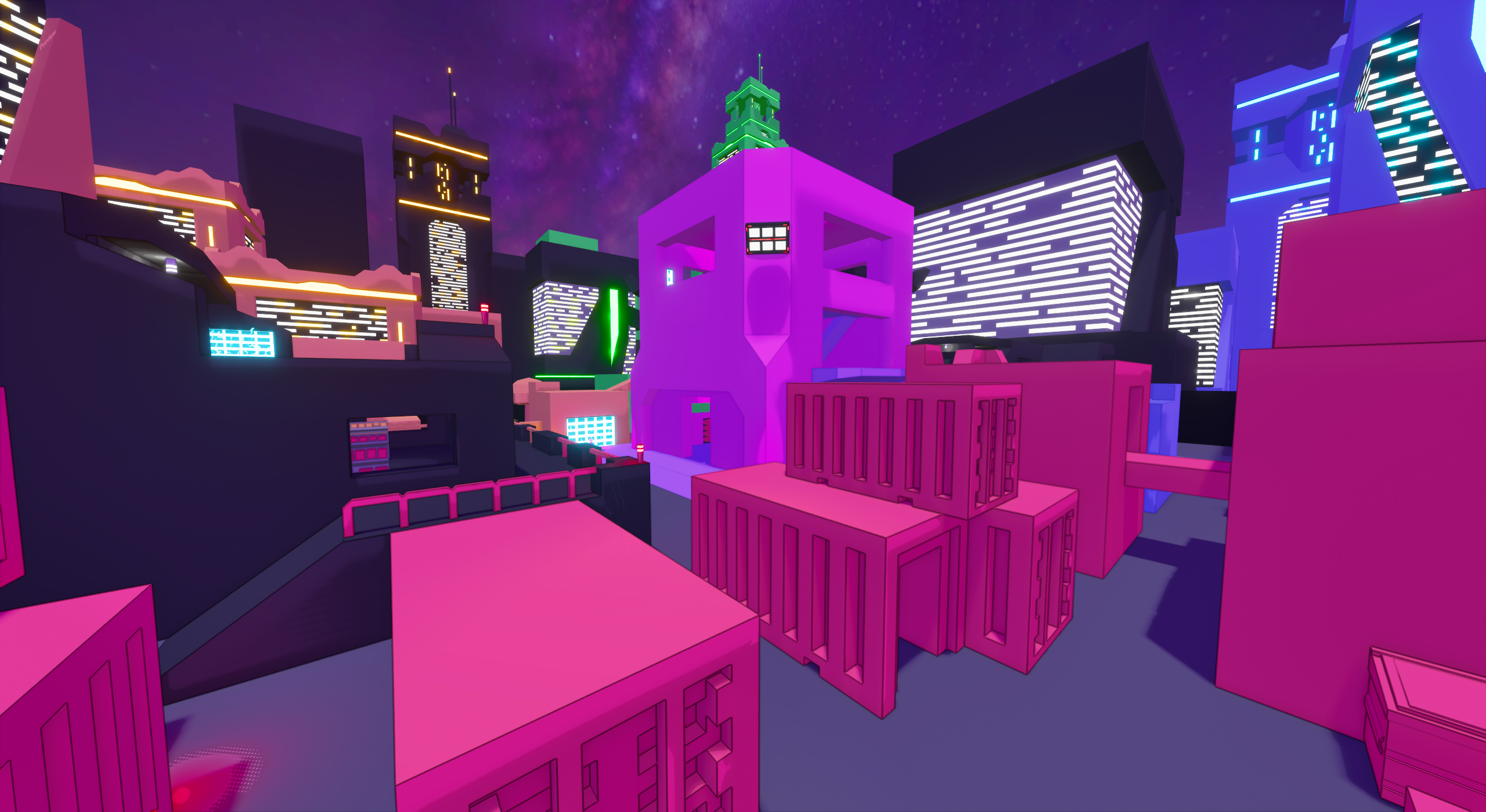
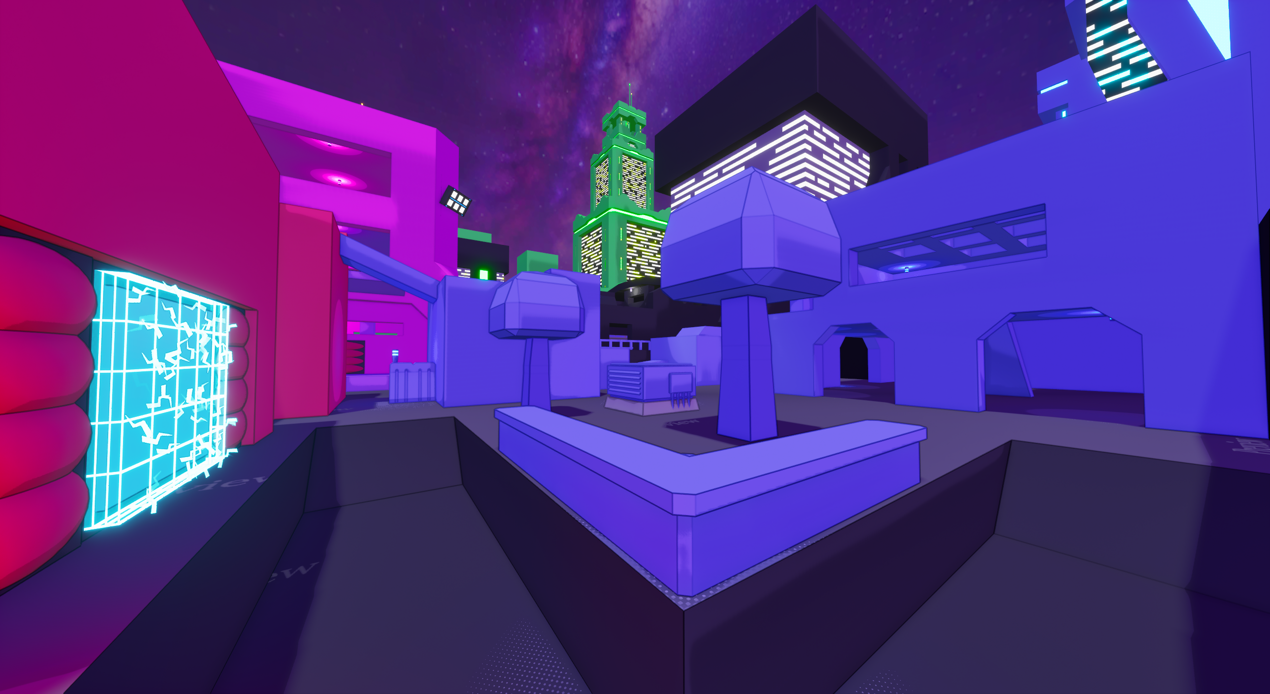
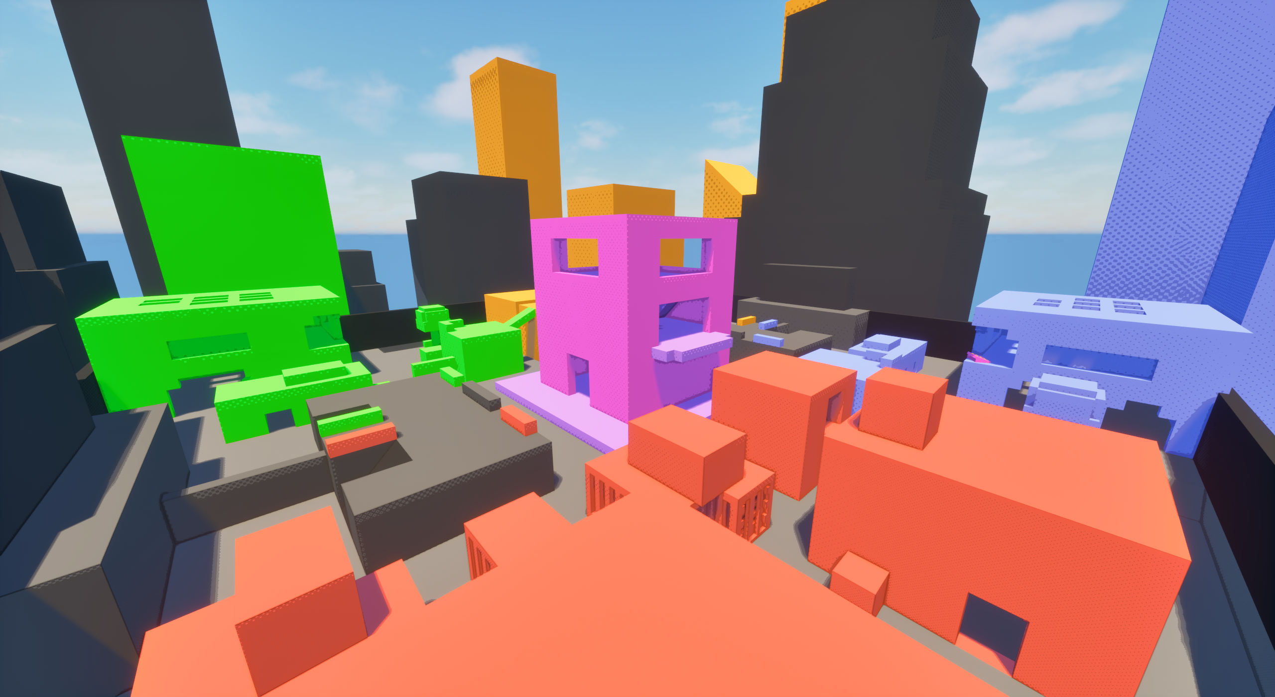
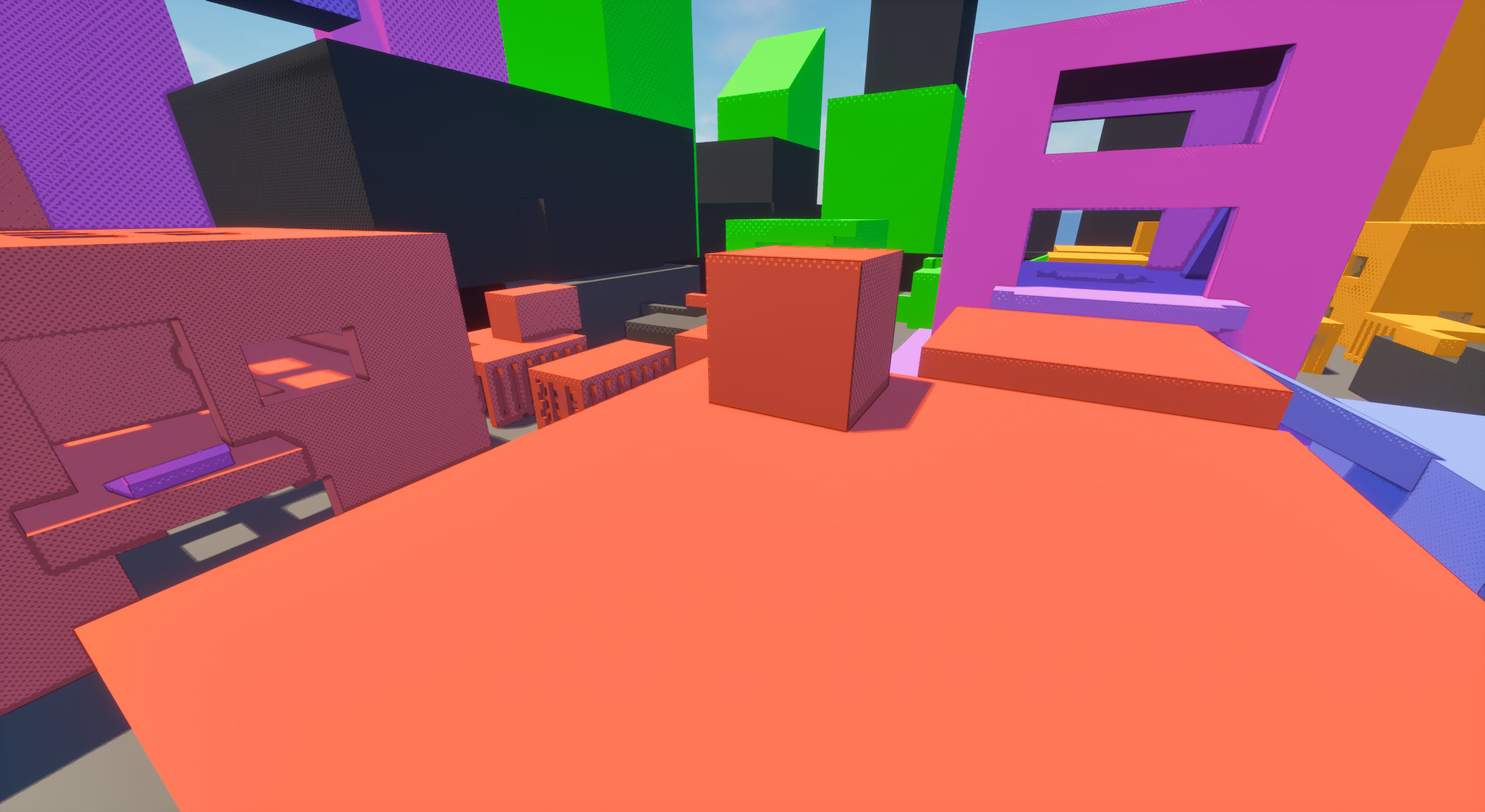
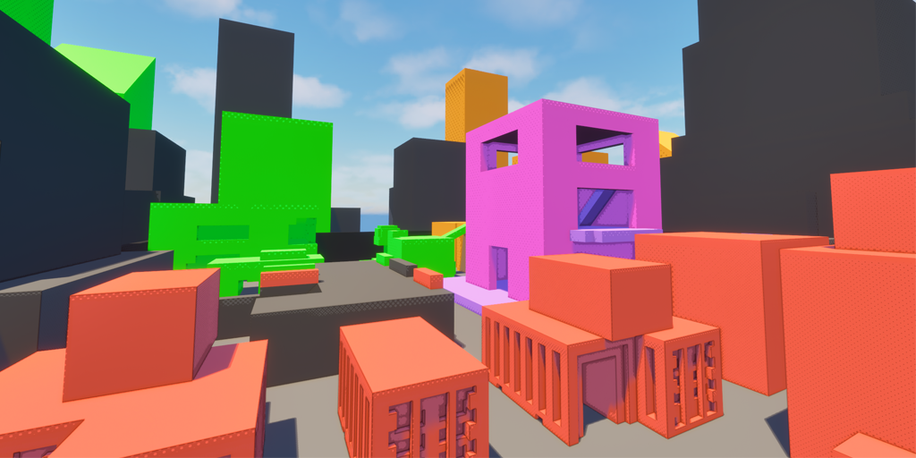
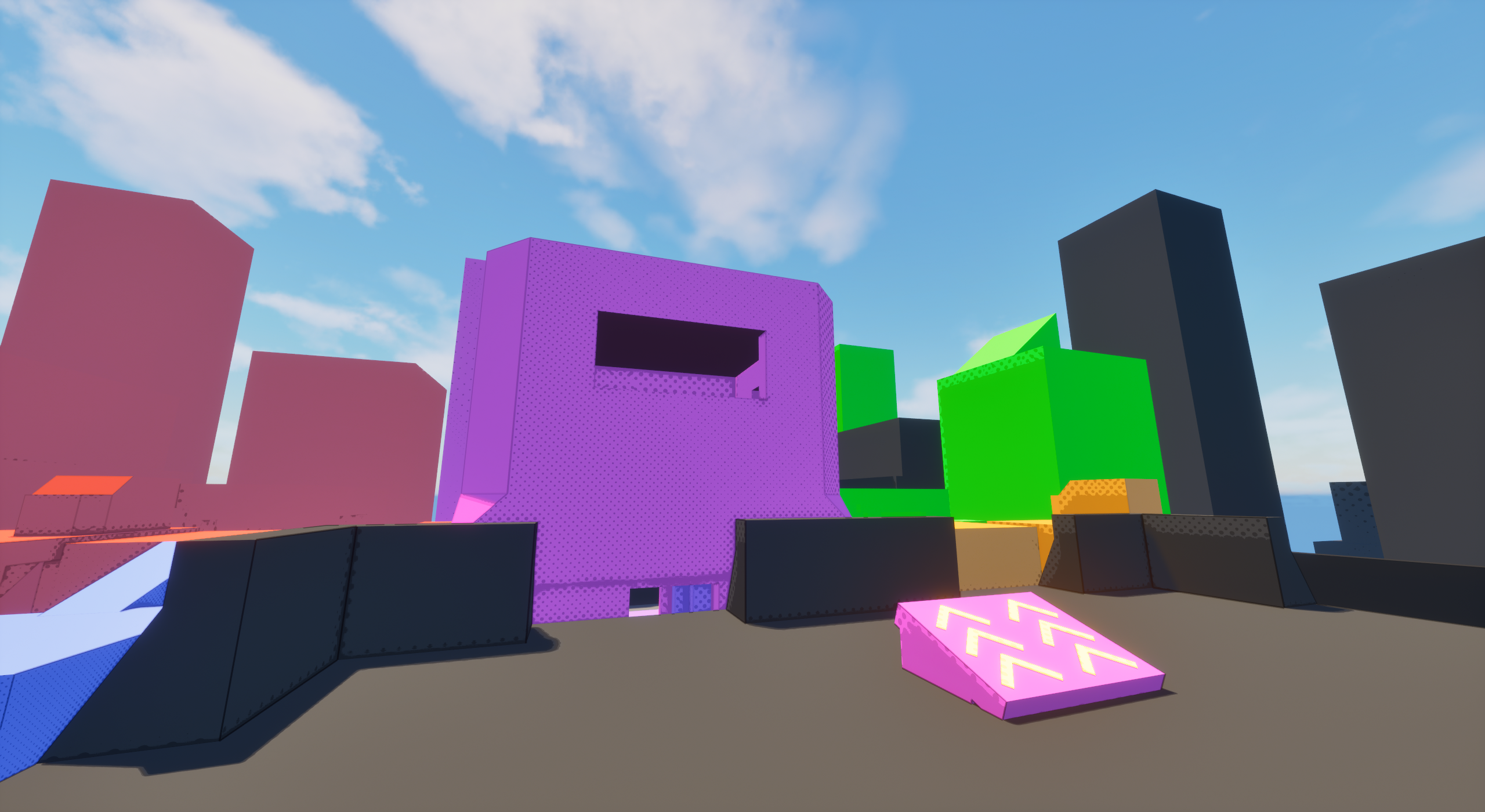
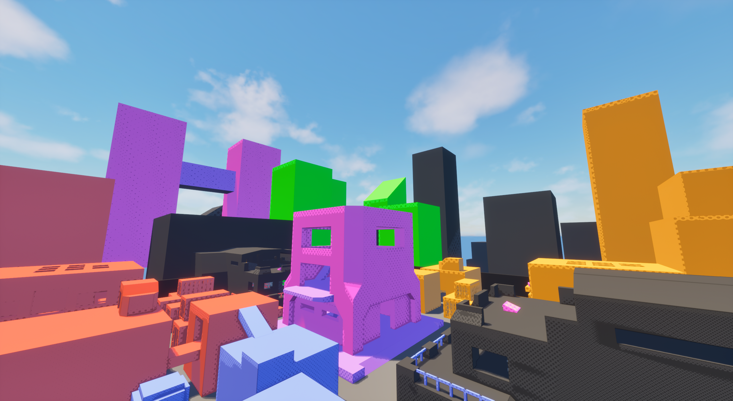
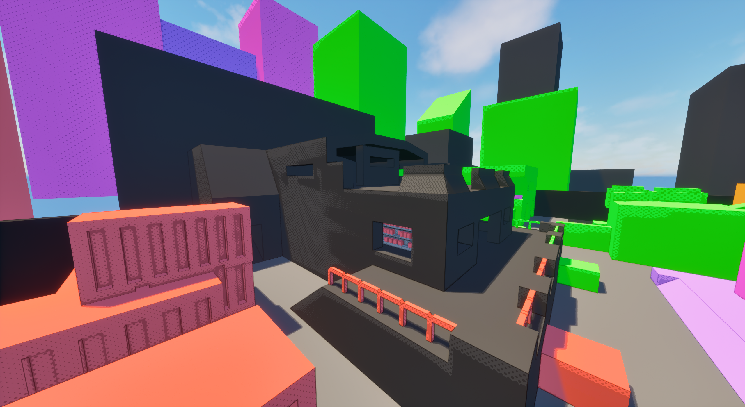
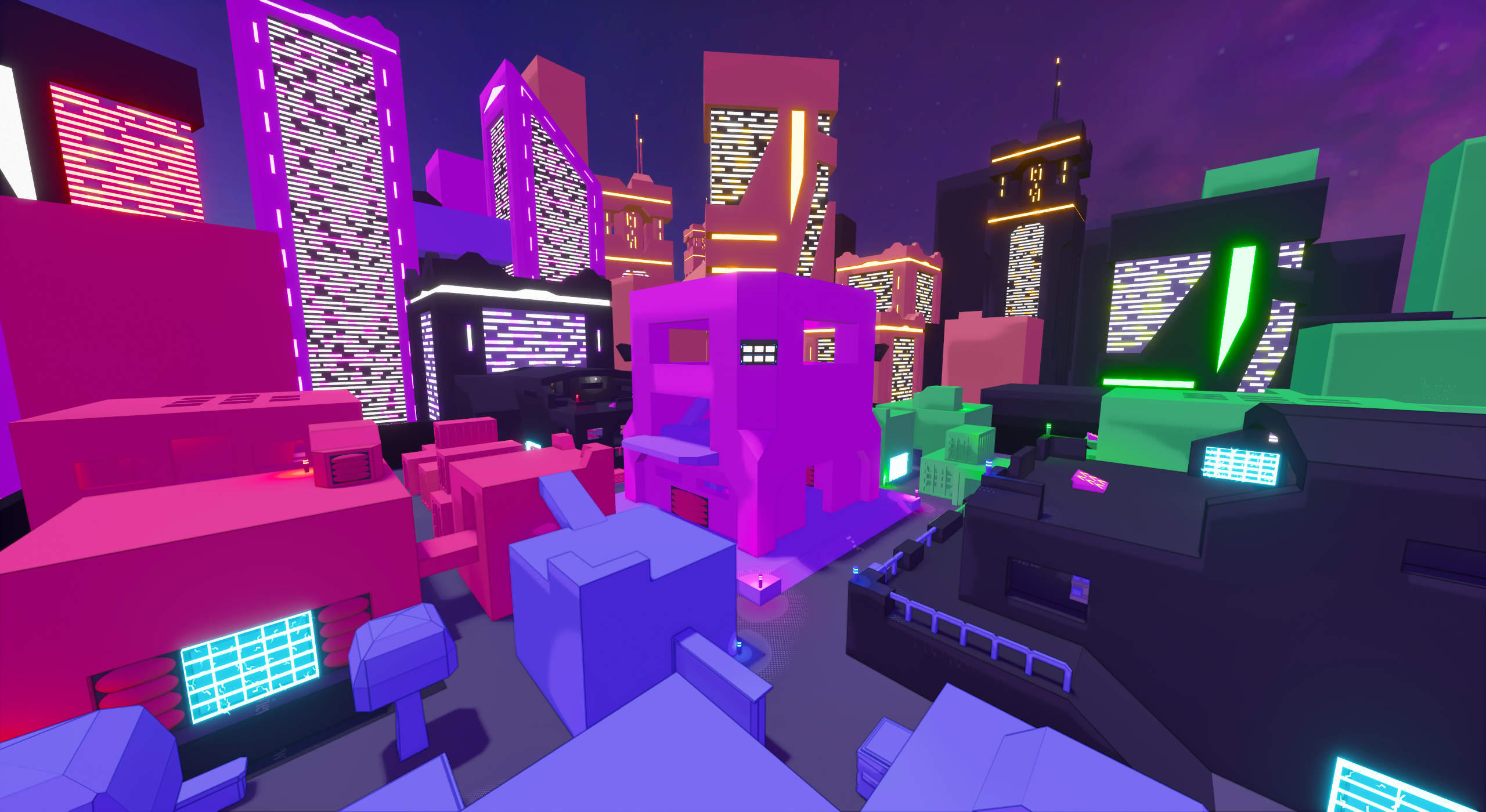
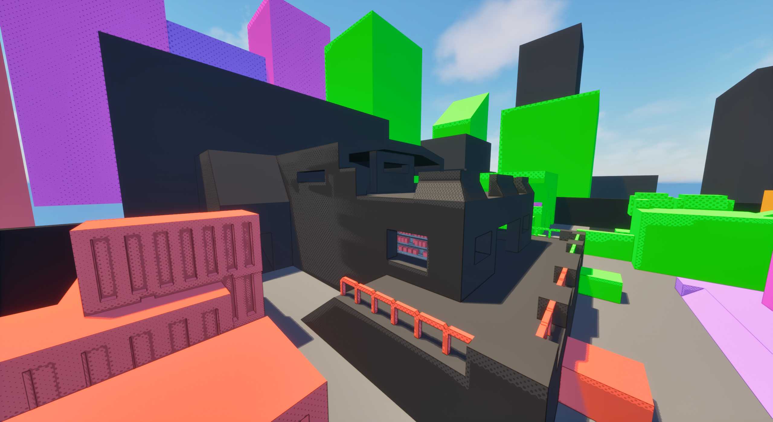
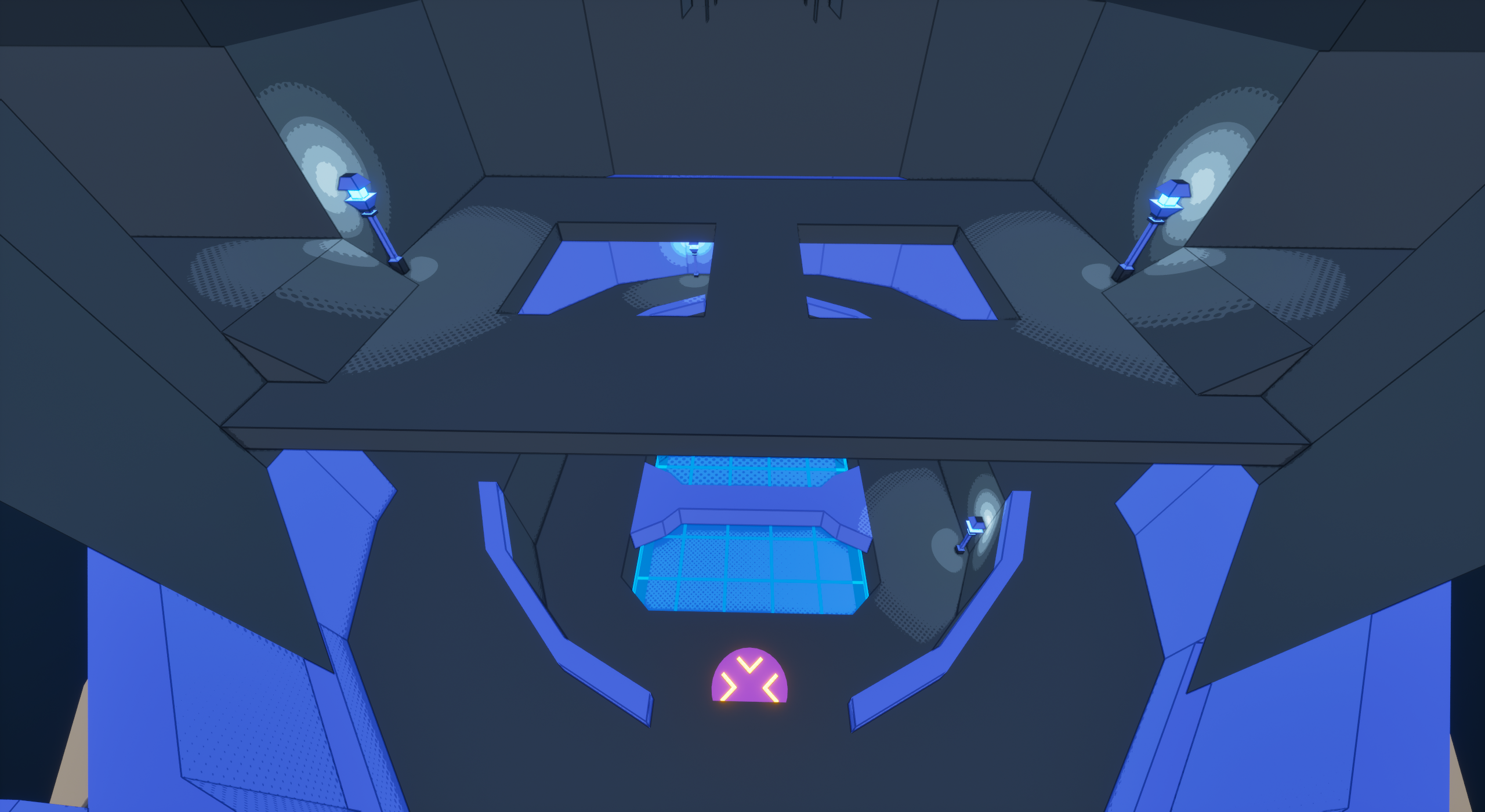
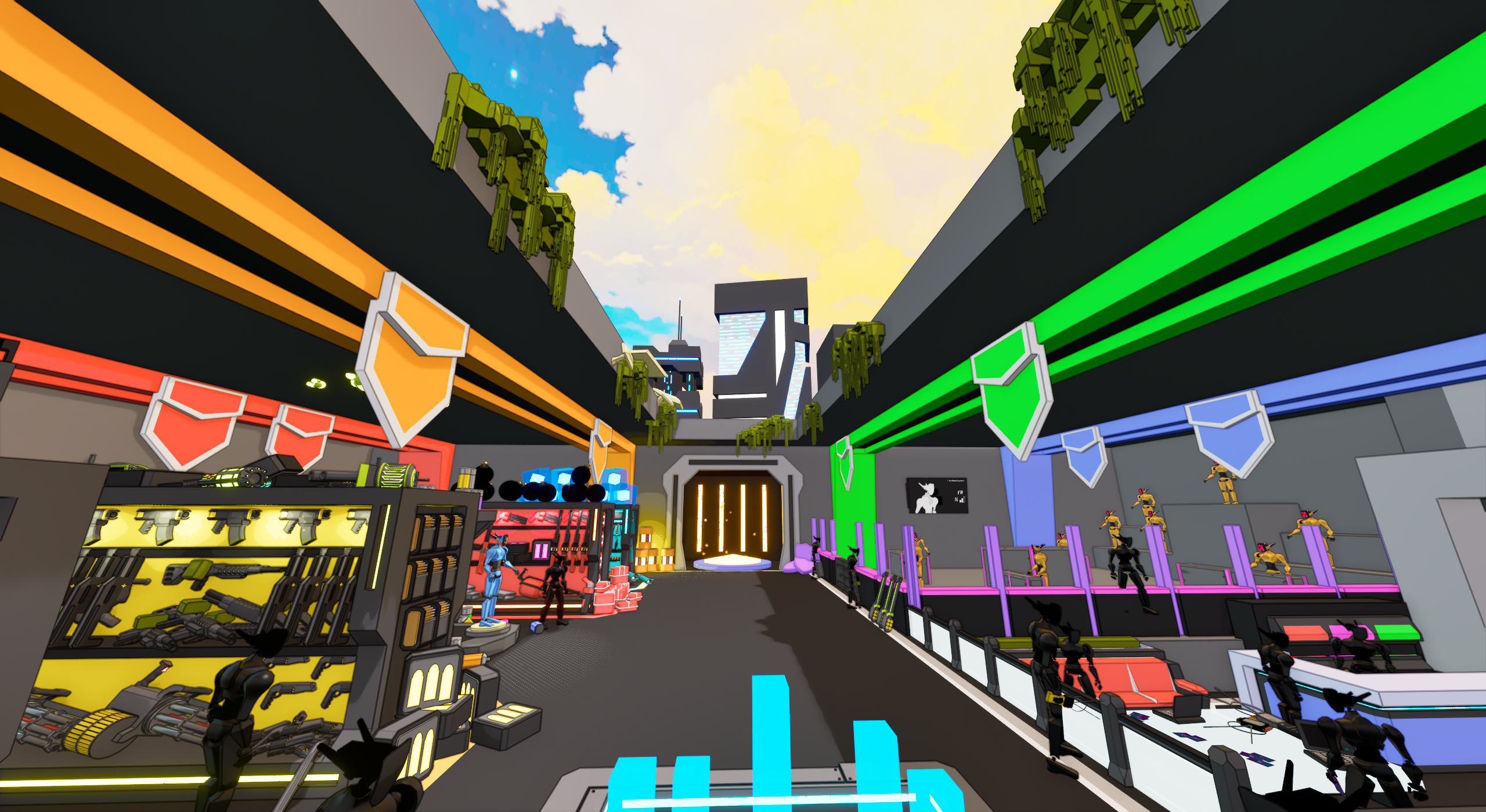
Surveillance takes place in an overly-lit city, bustling with night-life. Players can traverse between buildings for close quarters engagements, or wander the rooftops for a shot at some long-range duels.
The centerpiece of this map is a large tower, with advantageous sight-lines over most of the map (And contains powerful goodies). On its biggest layout, two large buildings open up on the sides of the map, providing another access route to the top of the tower, and teleporters for quicker cross-map transport.
The gray buildings alongside Surveillance’s exterior.
An overview of the map with a better view of the background skyscrapers.
Surveillance’s Preview Image.
Park area found outside of the Blue and Orange spawns.
Rooftops found on each side of Surveillance between the two teams.
Early Design
Surveillance was the very first map I worked on, and was the second map ever for C4. This left the door wide open on directions for the map’s design. In order to narrow down what I wanted to accomplish with the map, I looked at what Playhouse already provided.
Playhouse has a lot of corridors and smaller arenas, heavily favoring mid and close-range combat. Long range weapons could still perform well, but weren’t quite in their ideal environment. From my time spent with our weapons, I knew Playhouse wasn’t large enough to push the upper limits of many weapons, so I thought it’d be valuable for Surveillance to give players more space for distant engagements.
The center of Playhouse was also a very vulnerable position, with numerous advantageous sight-lines against anyone who dares to enter. As such, players would tend to gravitate away from the center, often orbiting it. I decided to try flipping that on its head, creating a map where center control was necessary to fight over.
So with those experience goals in mind, Surveillance was born.
A scenic shot of early Surveillance.
Iteration 1
After spending some time researching and sketching out concepts, I began to create the sketch I felt the best about.
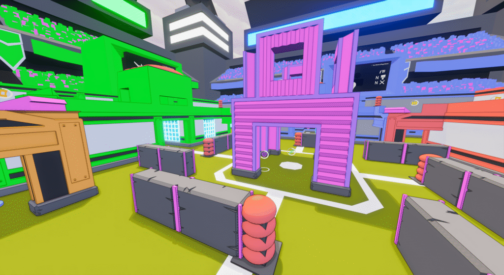
To get the middle to feel like a key location, I made it a tower with advantageous sight-lines all over the map, filled to the brim with key weapon and power-up spawns.
Upon testing, this design worked admittedly a bit too well. On any layout the tower was accessible on, it turned into sheer chaos, rather rapidly devolving the match into a desperate scramble for control. With the tower’s spawns and sight-lines, players couldn’t just ignore the chaos either, as doing so would give whoever remained a huge advantage.
The colored buildings on the sides of the map also had a little too much overlap between the floor below them and their rooftops. It wasn’t a super noticeable pain-point compared to the chaos of the tower, but I wanted the alleyways and rooftops to feel distinct, so those too got marked for some slight alterations.
Bird’s eye view of the original map from red’s spawn.
The very first version of the rooftops.
Surveillance’s first preview image.
The old gray areas found on the edges of the map.
Old bottom floor of the center tower.
Iteration 2
With the design of Surveillance’s center tower working a little too well, I wanted to alleviate the pressure it caused, and add interest to the vacant grey-zones, as those did very little for the map’s flow.
By making the tower slightly larger, and improving some areas of maneuverability on the outskirts of the map, it allowed for the tower’s advantageous position to be slightly weakened, and allowed for key spawns to move out of the tower, giving players other areas to explore.
To weaken the tower’s influence, I improved maneuverability on the edges of the map, giving players easier access to usable cover. This change also gave me space to shuffle item spawns, allowing key pickups to move away from the tower. Finally, to be safe, I slightly increased the tower’s size, giving a little more breathing room to any scuffles that happen within.
The grey areas saw the biggest change, going from a simple block to a new 2 story building. This change created more map space, gave players a new way to attack the tower via launch-pads on its second floor. On the XL layouts, these buildings also take on the radiation weapon spawns, giving players another reason to fight outside the tower.
Updated first floor of the tower, featuring more ramps, pillars for cover, and windows to launch projectiles through.
The launchpad found on the gray buildings that leads into the center tower.
Surveillance’s second preview image.
The new gray buildings added in this version of Surveillance.
New roof access added to the smaller building’s rooftops.
Visual Overhaul
When preparing for C4’s first demo release, existing maps got a visual overhaul. Surveillance got a night-time sky-box, so to play into that decision, I made sure to add a healthy amount of lights to the map and background to make it feel lively.
I also implemented various stage hazards onto the map, as they didn’t exist at earlier points in development. These added an extra layer of gameplay to the map while preserving its original feel.
High up view of Surveillance and its new background cityscape.
Surveillance’s Final Preview Image.

Overview
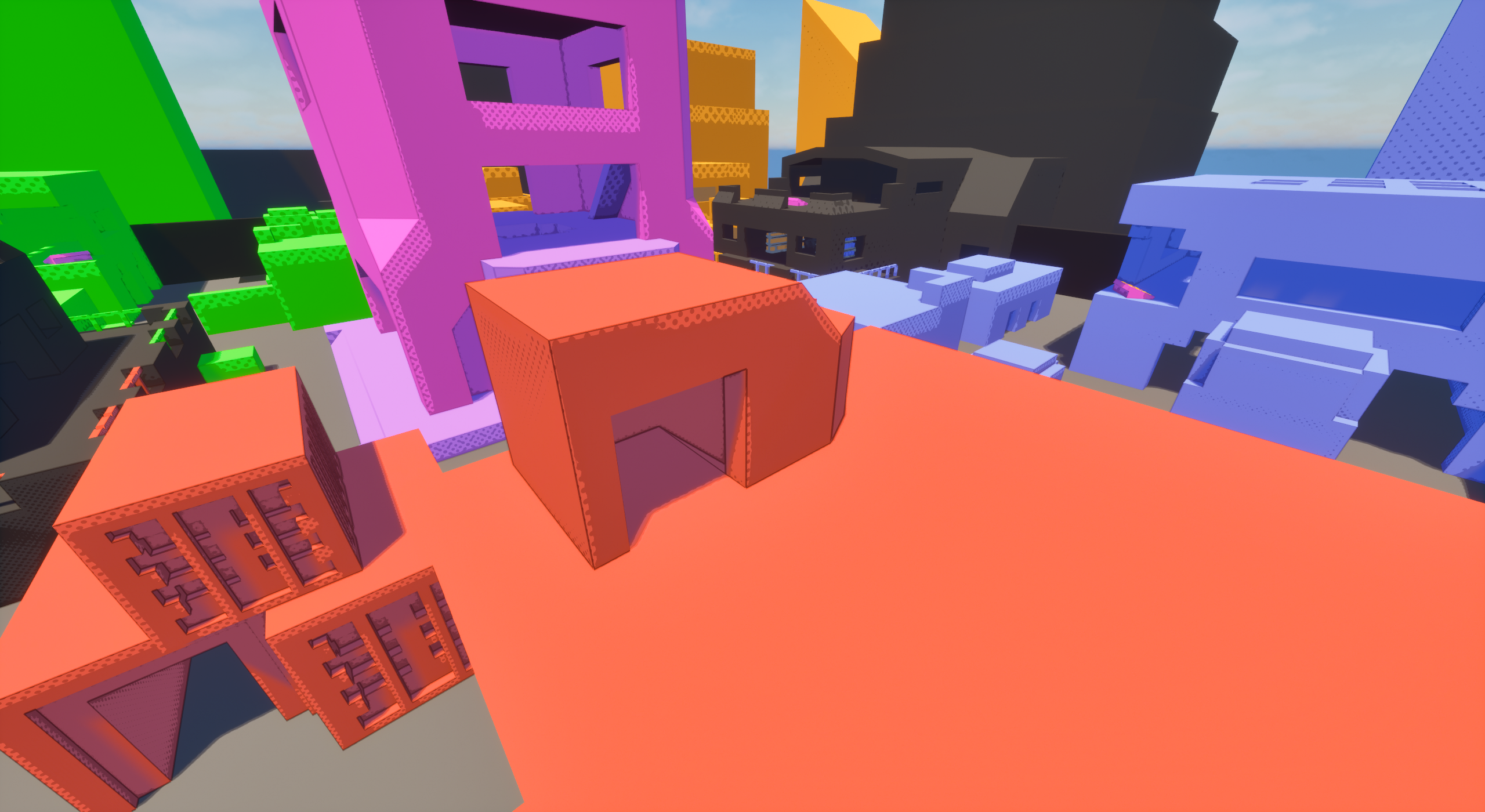
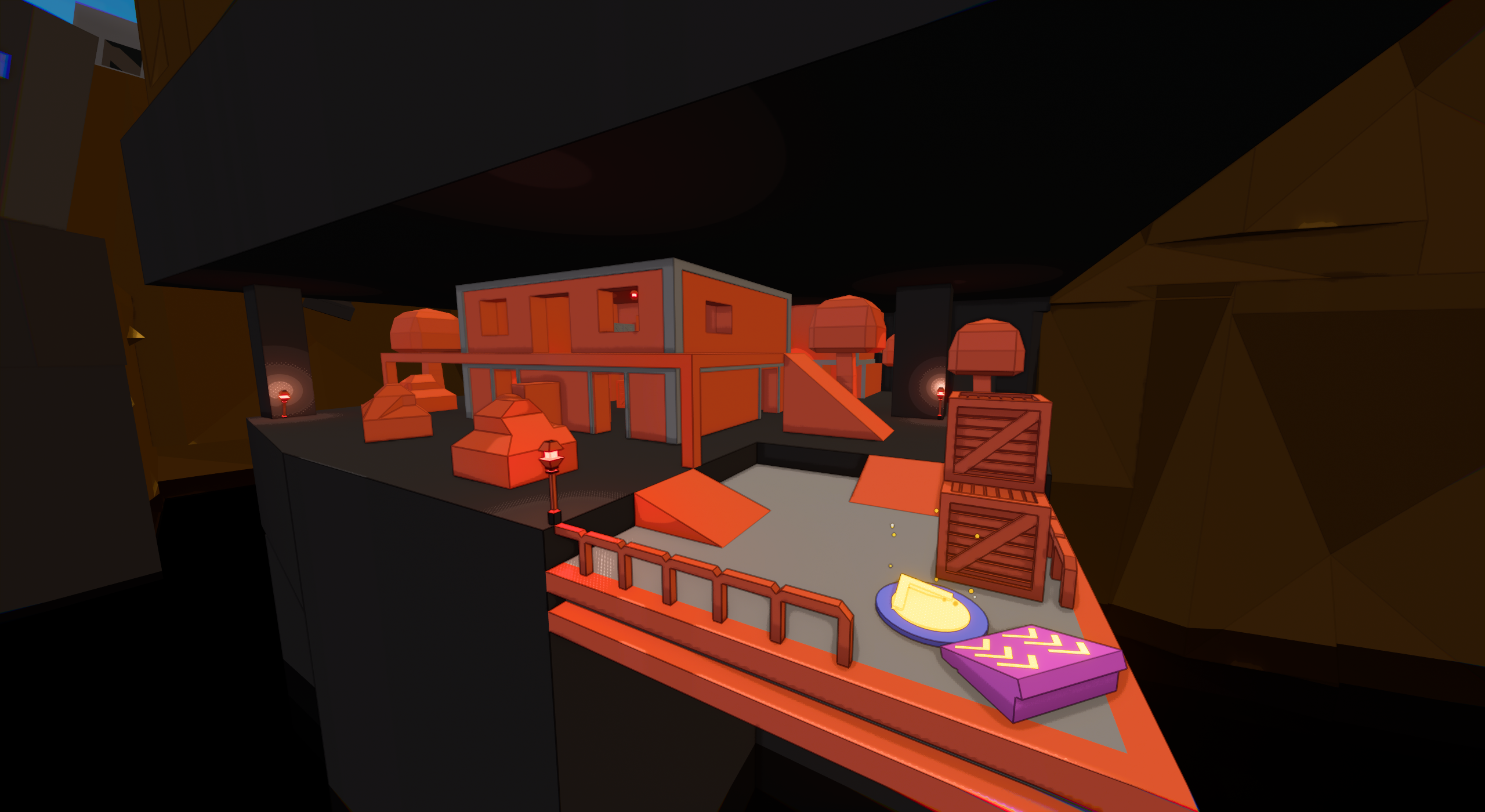
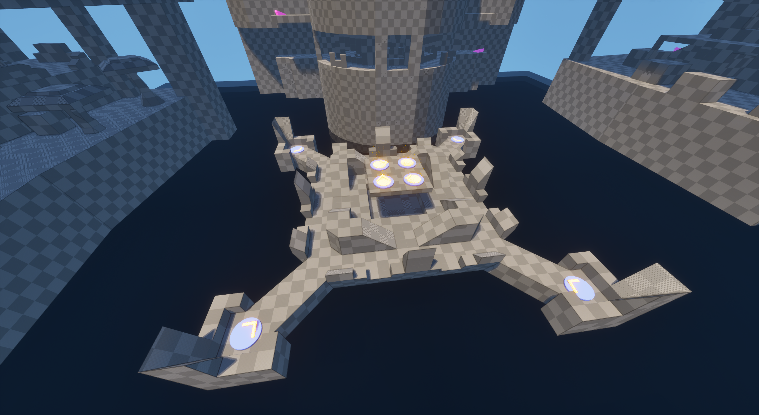
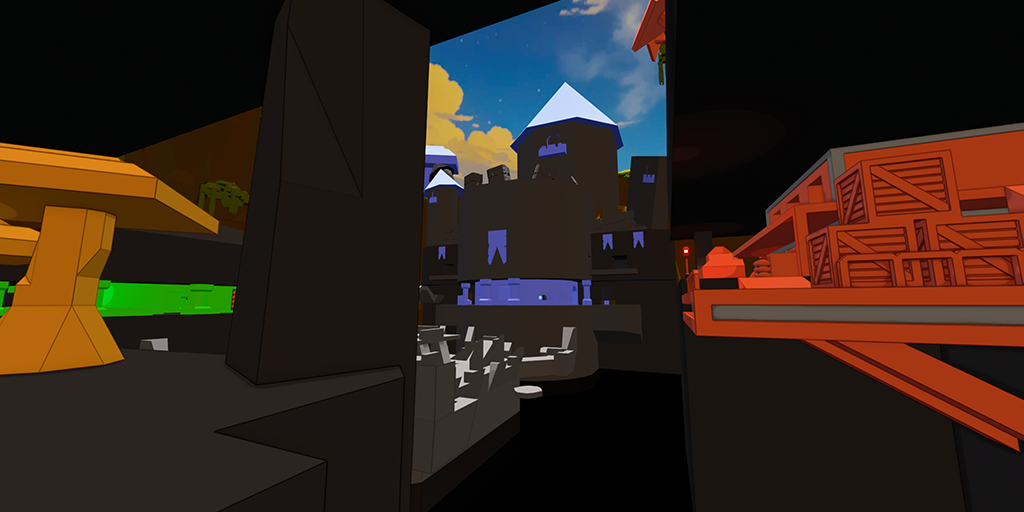
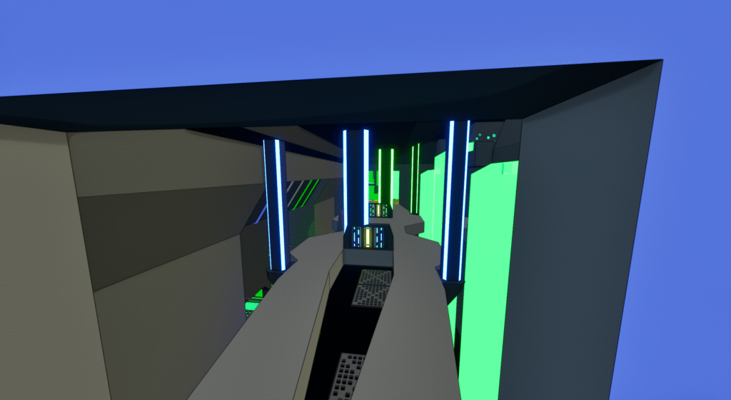
Excavation takes place in a massive ravine. Constantly in danger of falling to their doom, players traverse between five distinct areas via teleporters and launch pads to battle it out on the dangerous terrain.
Excavation’s big draw is it’s massive pit covering every edge of the map. Most commonly, players will make use of the various launch-pads to jump between the exterior zones. But if they’re feeling daring, players can take a teleporter into the center, which boasts powerful pickups and teleporters to every part of the map! However, it is also incredibly dangerous with tough terrain and little cover.
Excavation’s Orange area.
An exterior view of the blue castle on Excavation.

Excavation’s Preview Image.
Excavation’s Red area.
The interior room of Excavation’s Green area.
Early Design
The goal with Excavation was to really stand out between the maps. I also felt teleporters and launch-pads were more afterthoughts on our existing maps and wanted to give them more use. Considering we had just finished our very first stage hazards, I concluded it was time for some pit-jumping.
Excavation’s first layout took me a lot of trial and error through sketching on paper and moving the graybox around. But as I was keen on the pit-jumping sectioned off map, I pushed on.
Excavation’s early version of its mid-teleporters transportation design. Featuring launchpads in the background.
Iteration 1
After much effort, Excavation’s first layout was born. Breaking the tradition of mirrored maps, each section of Excavation was completely different, creating a map with a lot to explore.
These areas each being different did make it challenging to balance them all out. In this iteration, certain areas did stand out as lacking compared to others. Primarily blue’s tower and the orange caves felt lack-luster.
The teleporters were also a bit finicky, leaving traversing using the center a bit of an off experience.
The first version of the blue castle’s only room.
The original top of orange.
Excavation’s first preview image.
The first version of the green area’s interior room.
The original orange caves.
Iteration 2
While its uniqueness meant it took getting used to and thus more time to test out, Excavation only needed a handful of smaller changes.
Blue got a proper second floor and back rooms, allowing for much more space in that area. This allowed for the pickups, spawns, and other attributes of the area to be properly spread out, allowing it to flow smoother and more akin to the other zones.
Orange simply had more room given to it, letting it feel less like a simple hallway to walk through.
Along with some smaller tweaks to the other zones, I was able to make the teleporters feel a little smoother to use and bring each area closer in line with each other.
These changes also accompanied various layout adjustments, with M getting a complete overhaul. Blue area changes being a key part in this rework. This let the M map be more enjoyable and less linear for smaller lobbies.
Blue castle’s new main room, featuring a back hallway and entryways to the new side rooms.
New orange top area..
Excavation’s second preview image.
Green’s interior room with the expanded balcony section and extra entryways.

New orange caves.
Visual Overhaul
Excavation received slight changes for its visuals, entirely consisting of further background detailing to bring it in line with the now sport arena of Playhouse and glowing cityscape of Surveillance.
A wide shot of Excavation featuring new background details.
A shot of Excavation’s castle with the new mushroom and ruin background details.
A comparison of Excavation before and after its background improvements.

Overview
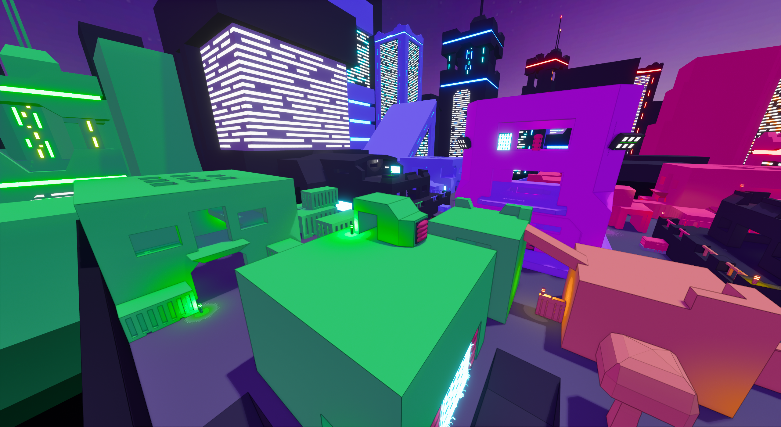
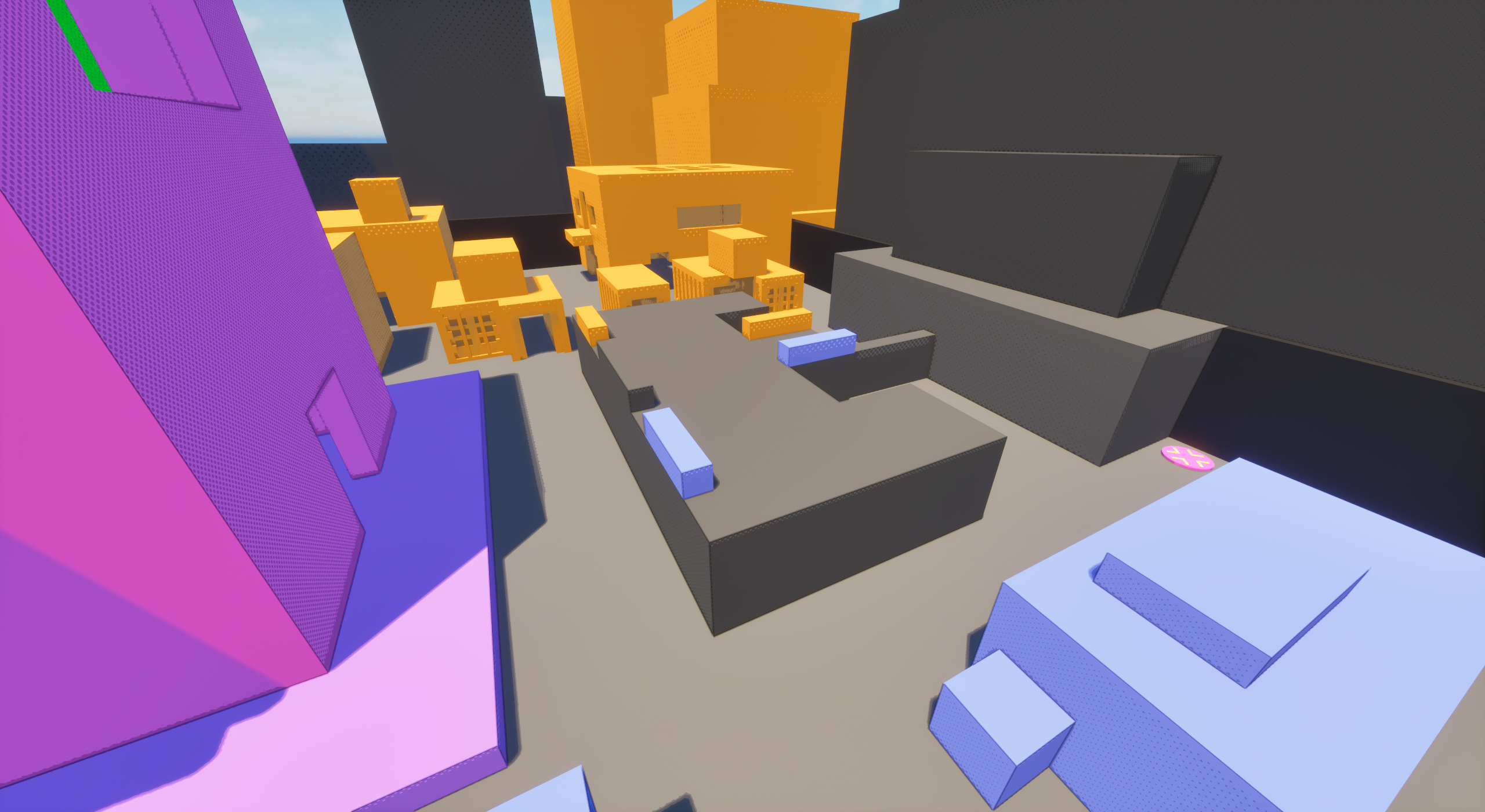
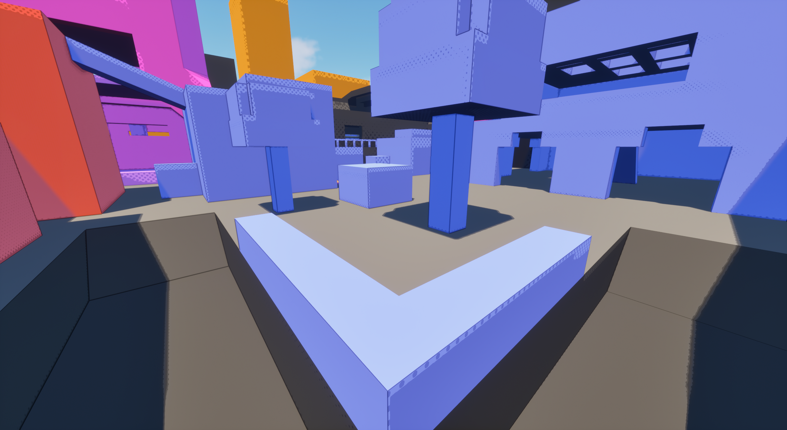
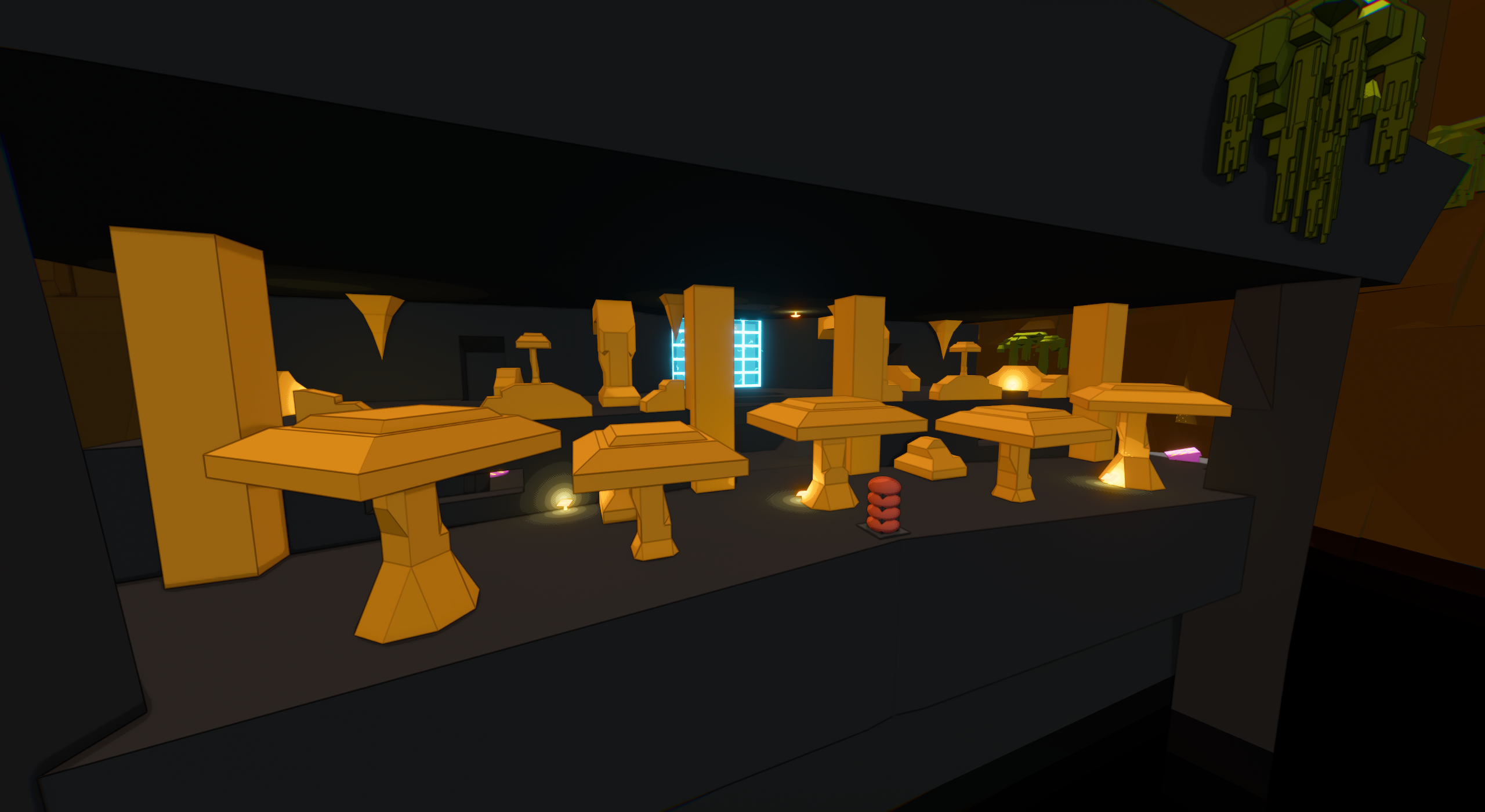
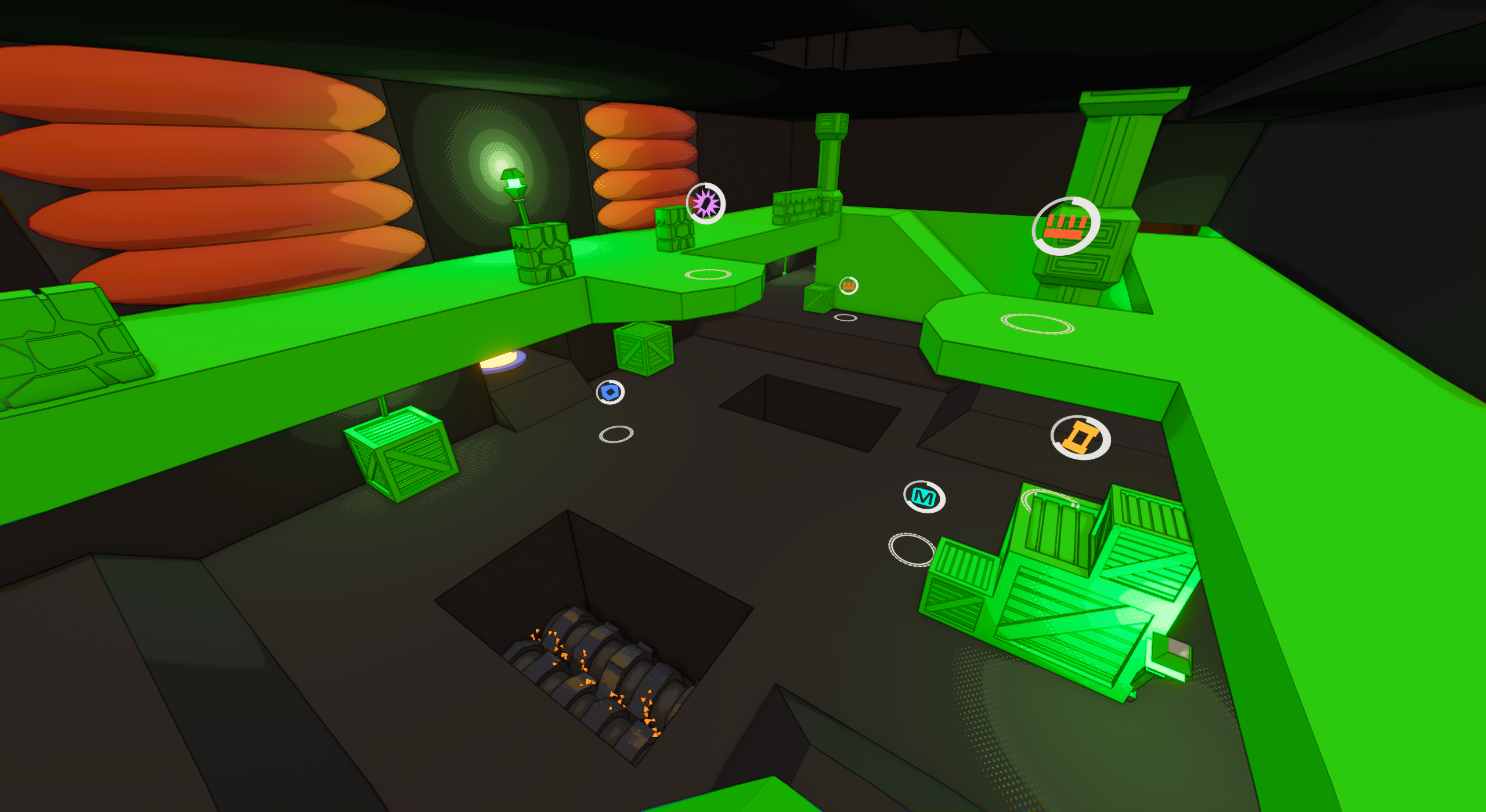
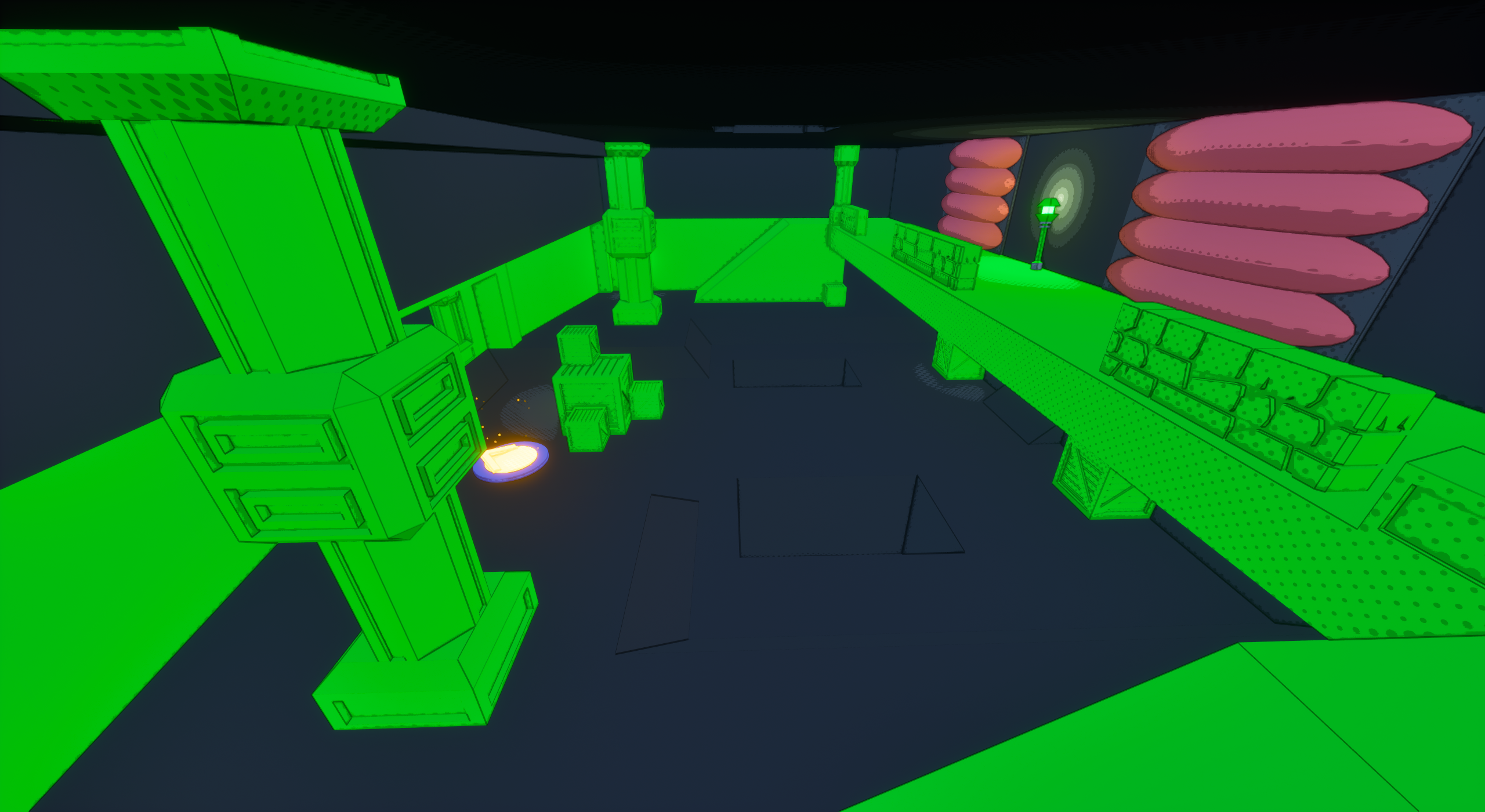
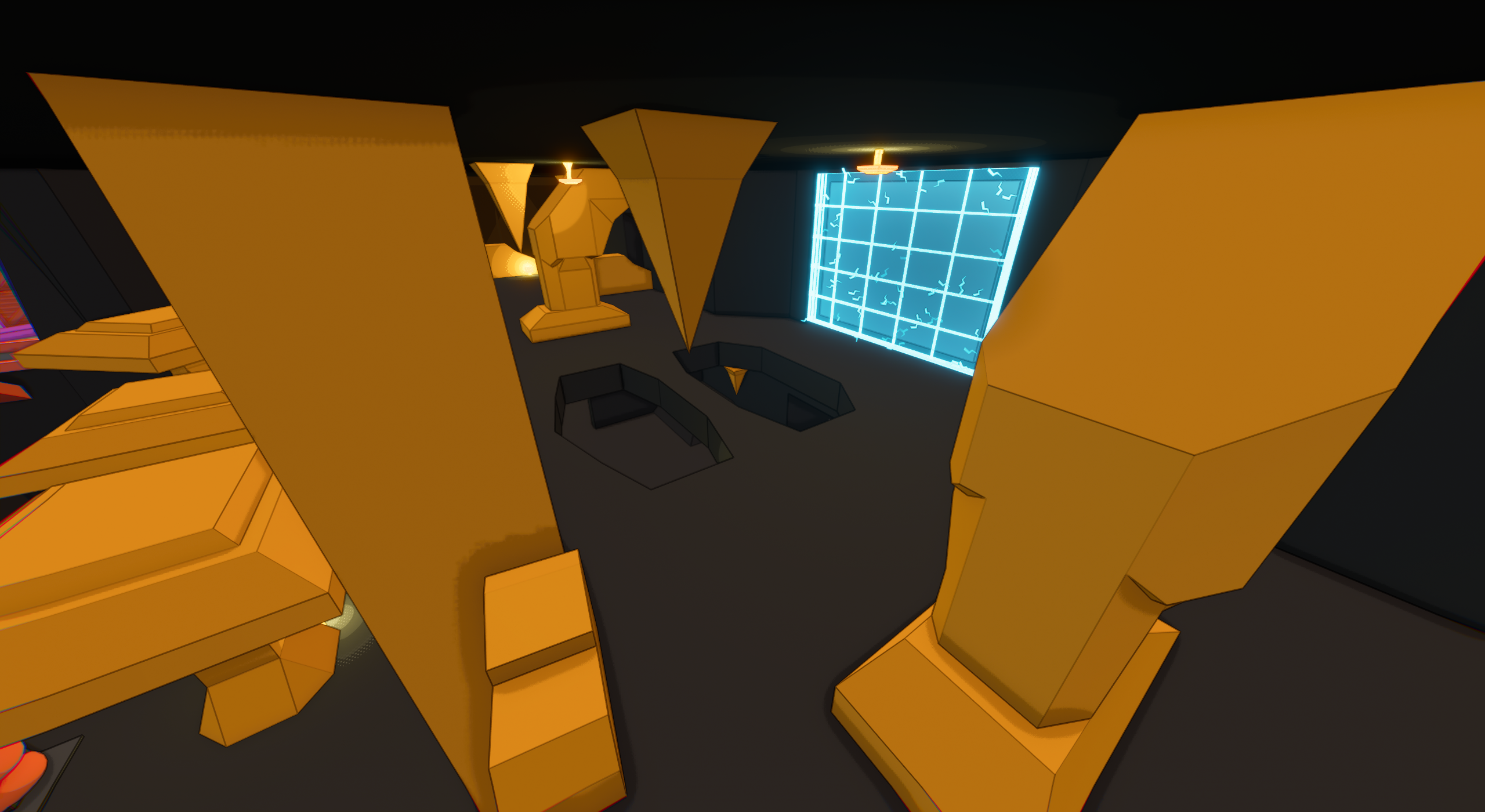
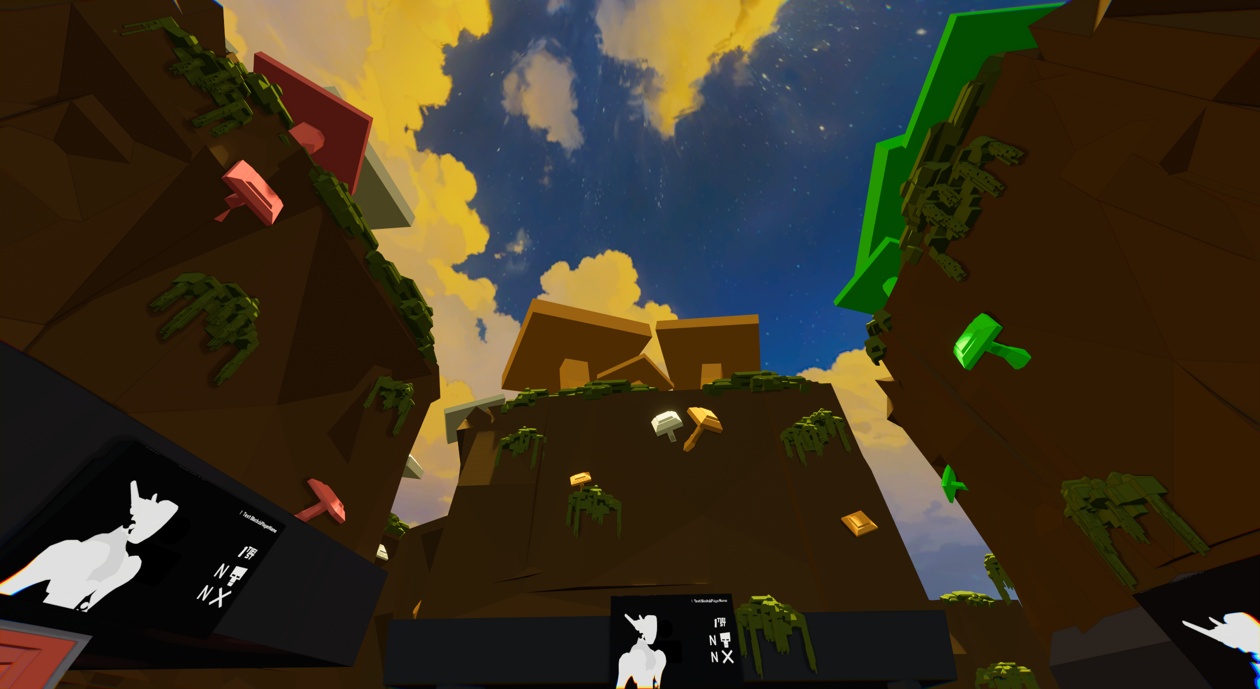
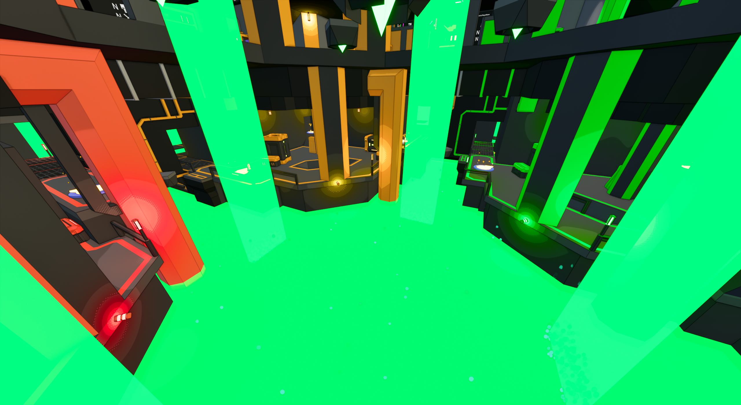
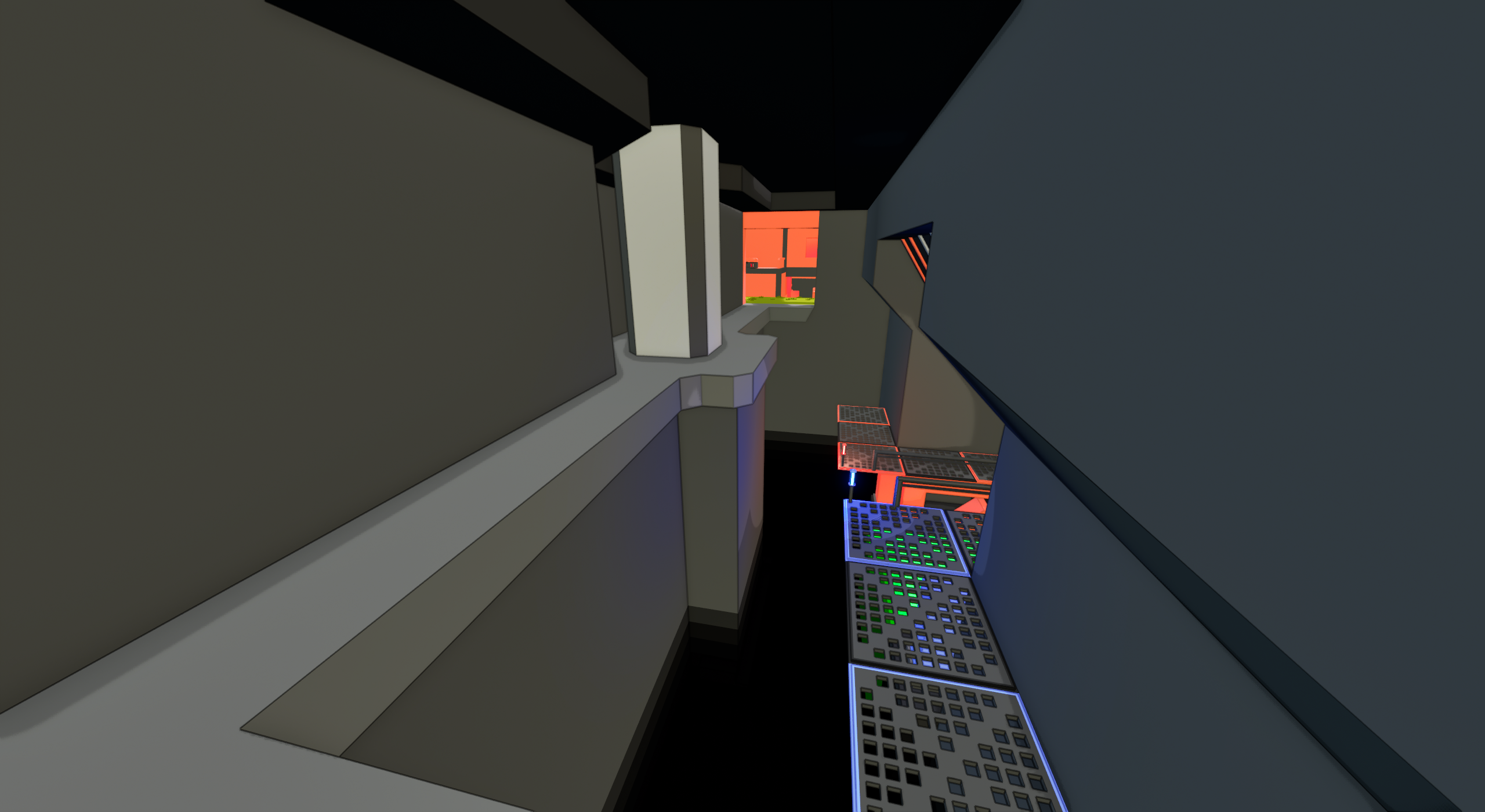
Taking place in a poorly maintained power facility, Corrosion places players in numerous tight rooms and corridors, encouraging close range scuffles. The state of the facility also means there’s a lot of radioactive waste around, so it’s important to watch where you step.
The most notable feature of Corrosion is the previously mentioned radioactive stage hazards, most notably made use of within the giant center pit of the map. These hazards are also scattered elsewhere, meaning movement needs to be chosen carefully in the already constricted space the map holds.
One type of outside area, used by Orange and Blue. Has a more nature focus to it.
Office areas found on the top floor of Corrosion.

Corrosion’s Preview Image.
One type of outside area, used by Red and Green. Has a more tech focus to it.
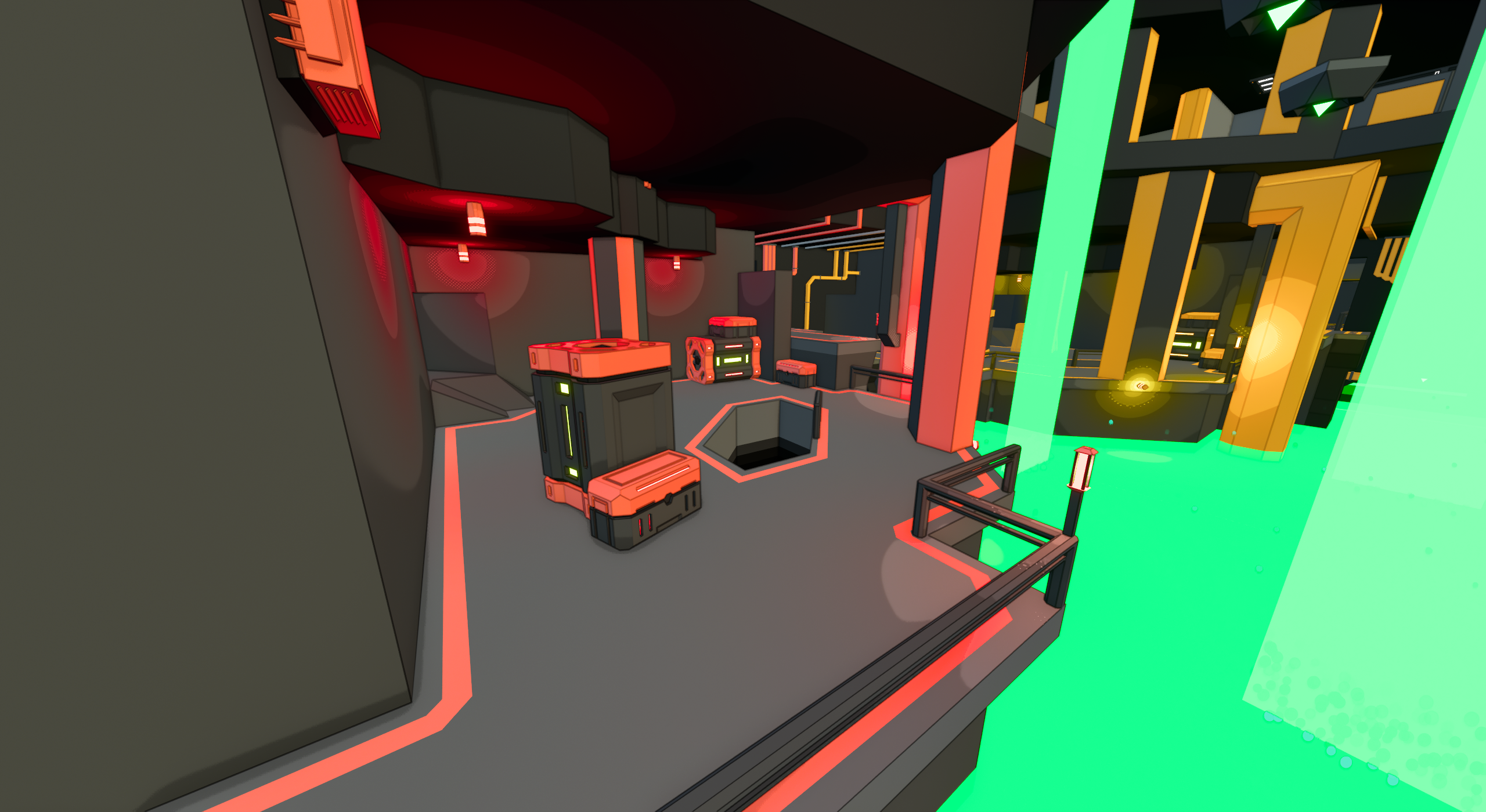
A view of the lower area’s platforms surrounding the center pit.
Early Design
When implementing stage hazards on our older maps, I had the idea for the rad themed stage hazard, and upon getting the idea, really wanted to make a map for it.
The very first idea was for this level to be a deep jungle level, but ultimately creating more natural looking environments was significantly harder and more time consuming. This difficulty inspired a slight change of course, and the idea to host Corrosion inside some sort of facility was born.


Even during the iterative graybox phase, corrosion had special blockouts for its radiation hazards.
Iteration 1
Considering the environments we had, it both made sense and worked well for the theme for Corrosion to cater towards close range engagements. Lots of hallways, tight bends, and objects in-between longer sightlines to make it easier for close-range weaponry to get an advantage.
Blocking off everything though began to feel too constricted, and catered a little too much towards close range. To offset this issue, I used the radiation hazards vertically, sort of like a wall of smoke. Players could still shoot or move through them (While taking damage), but they worked to disrupt sight-lines, which was the main target of their placement. It allowed some parts of the map to feel less crowded than some original versions where there was a lot more walls and pillars.
Close-up of the office carts found around the top floor.
Corrosion’s center pit.
The first rendition of Corrosion’s exterior corridors.
Iteration 2
Based on the first iteration, much of Corrosion worked well… Except for the long corridors connecting the outskirts of the map. They heavily restricted player pathing options, and left little cover for anyone caught inside. For a map I wanted to be more in-your-face with fights, these corridors were areas you needed a long range armament, a very notable buzzkill.
So, they got completely reworked. The odd side path got turned into a full bridge I filled with cover, and finally I expanded the grates below to offer more room and a secondary path if the bridge is a bit too hot. There’s also a secret path behind the radiation falls on the side, which can be a strong hiding spot if needed (And stores some helpful pickups in a pinch).


Slideshow containing views of Corrosion’s final and background geometry.

Overview
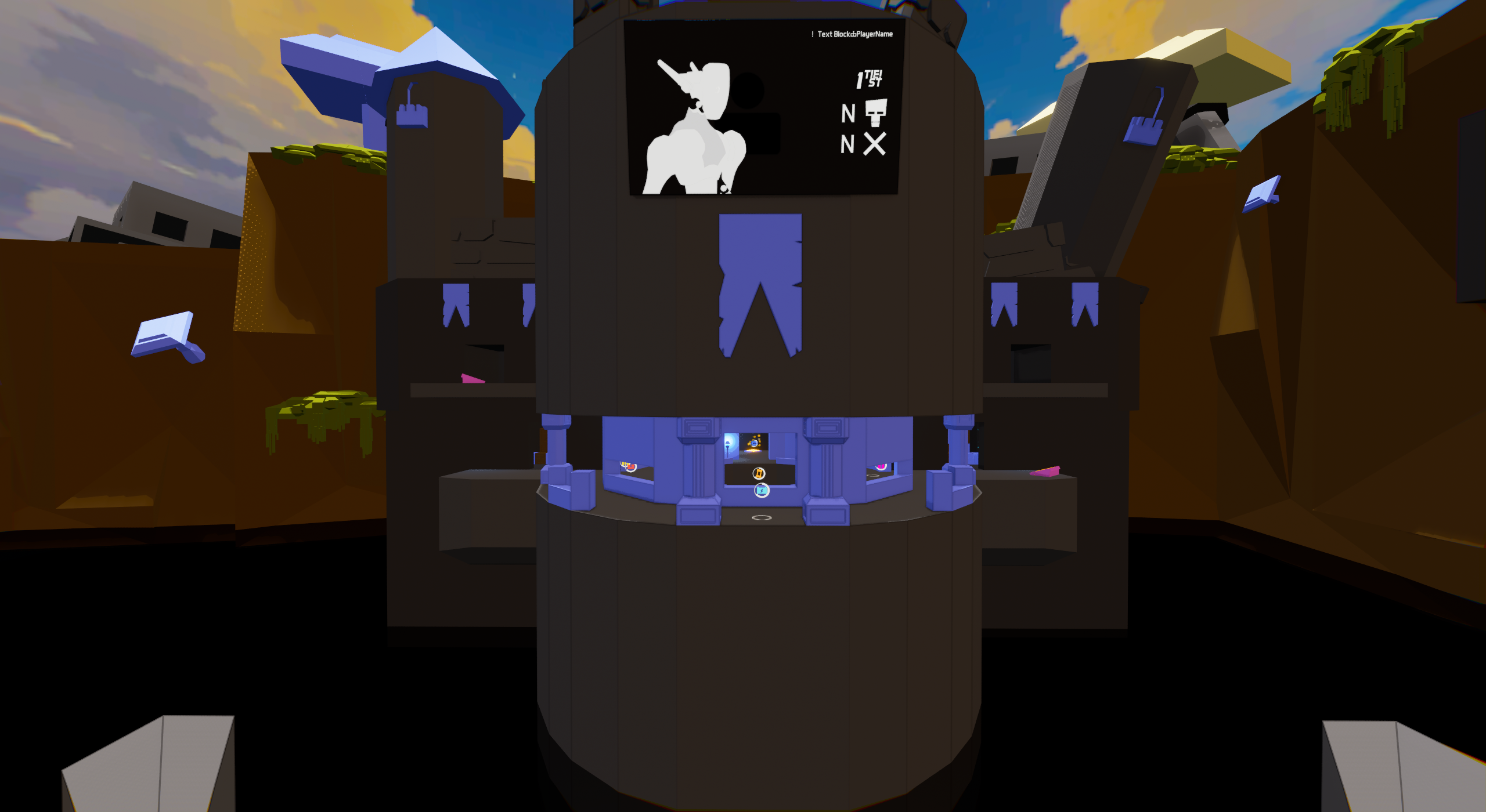
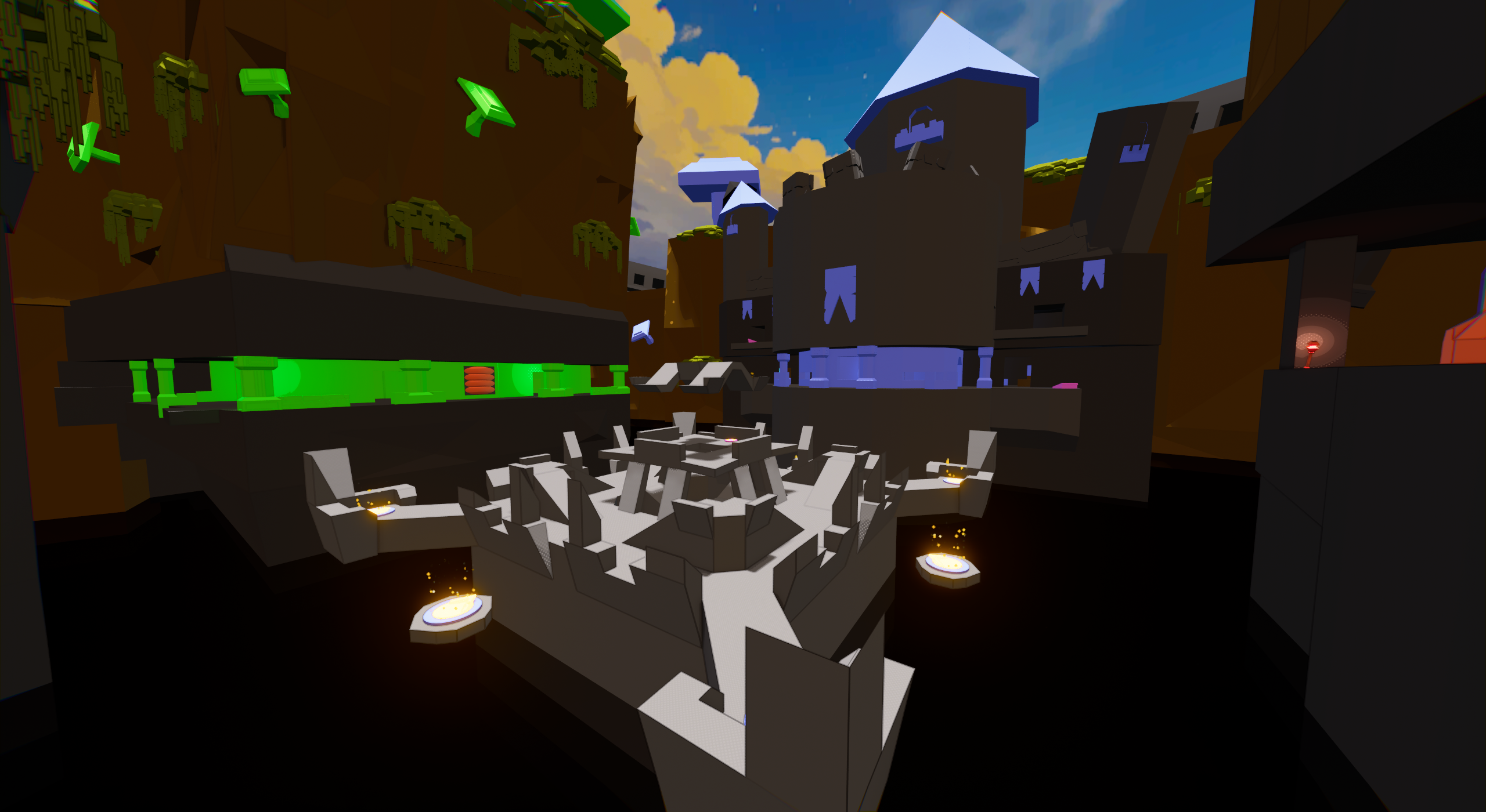
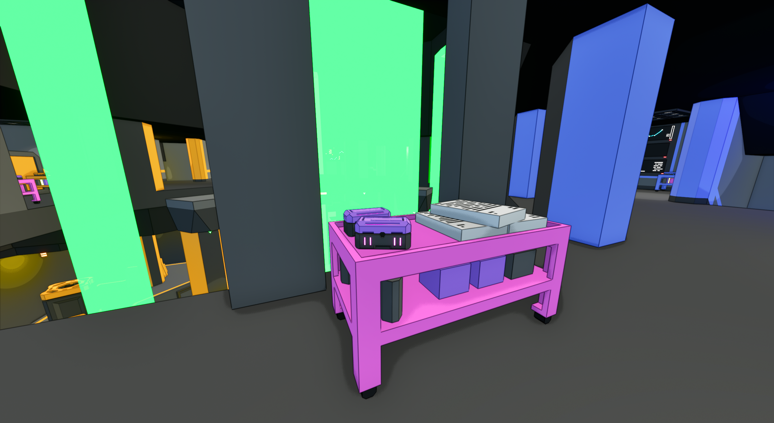
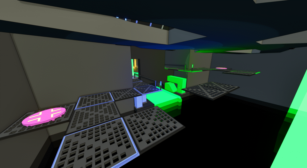
There was one space I designed for the game that was different from the others. This was the Lobby, and it was to be the area in the background players would see when setting up the match or other between-game activities. The one requirement was for it to provide a “social space” so player bots could slowly appear and be a part of the room once joining.
Because this area wasn’t playable like the other areas, it was much more an artistic design challenge than it was one from a functionality standpoint.
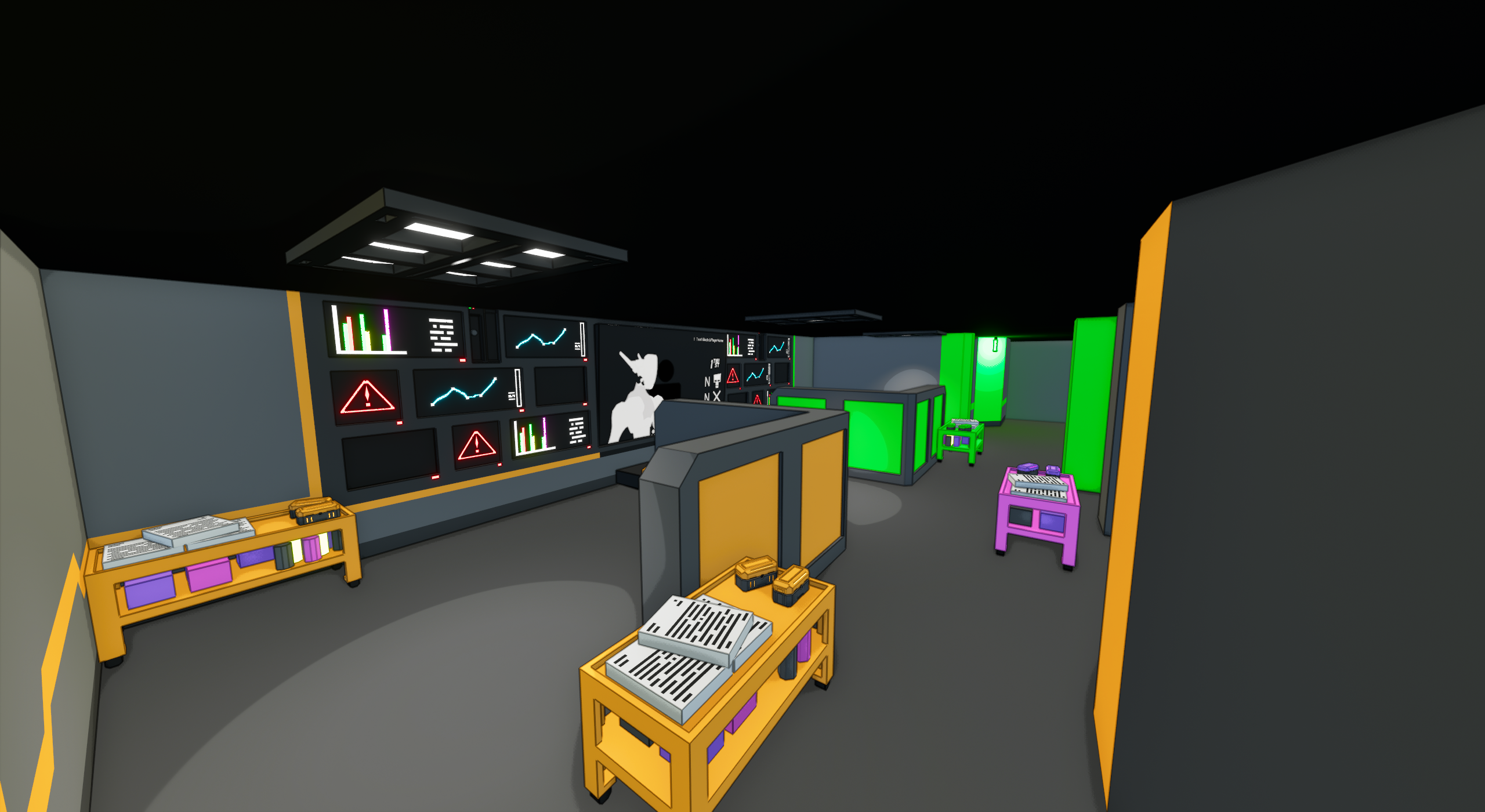
One extra feature I helped to implement was the holo-table seen in the center. The holograms on it will actually change to show the most-recently played or selected map! It’s a small detail but one I find quite neat.
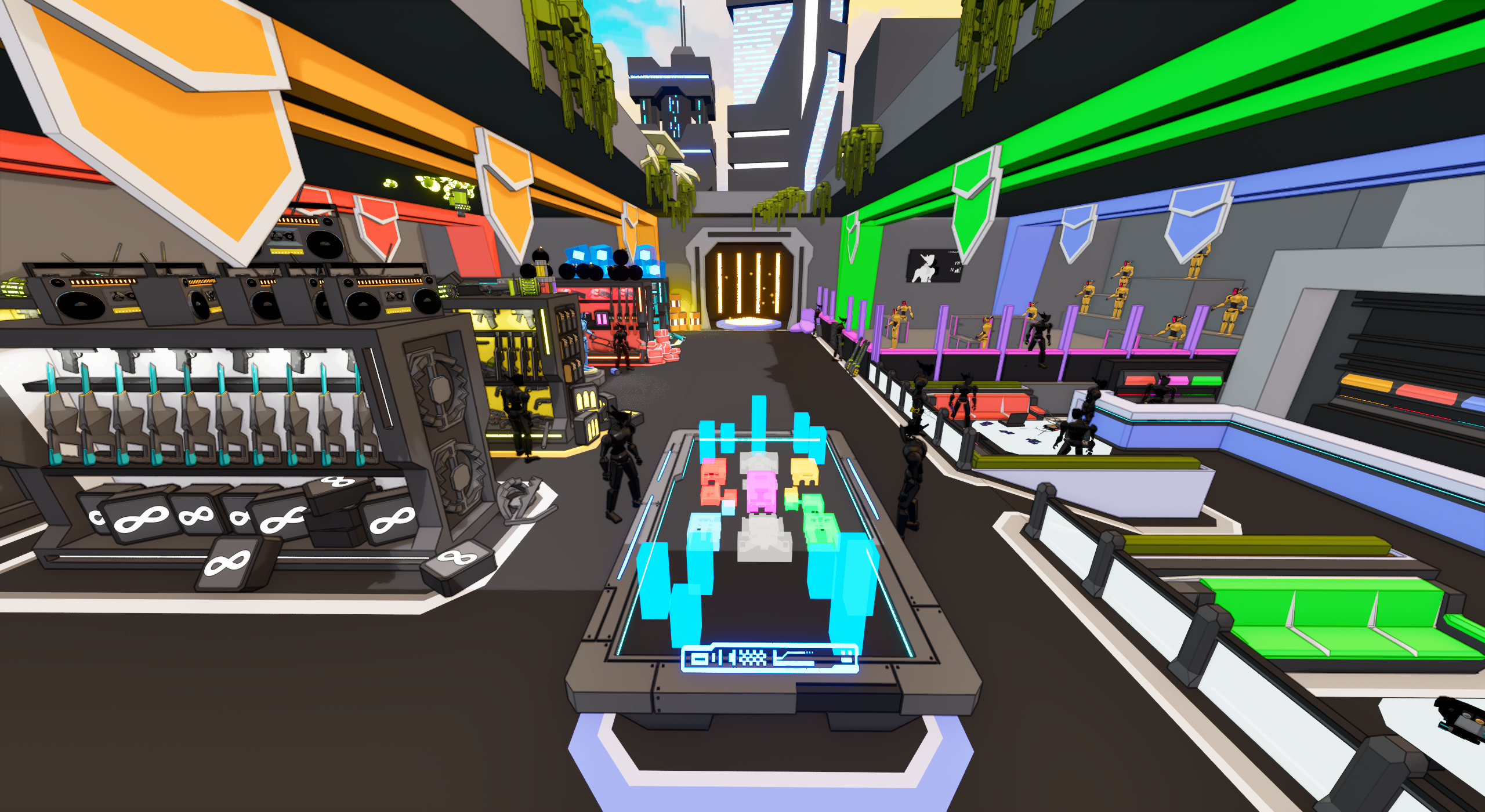
The standard view of the lobby players will see from the menu.
Left side of the lobby features weapon racks for most of the ammo types.
The view out of the skylight of the lobby.
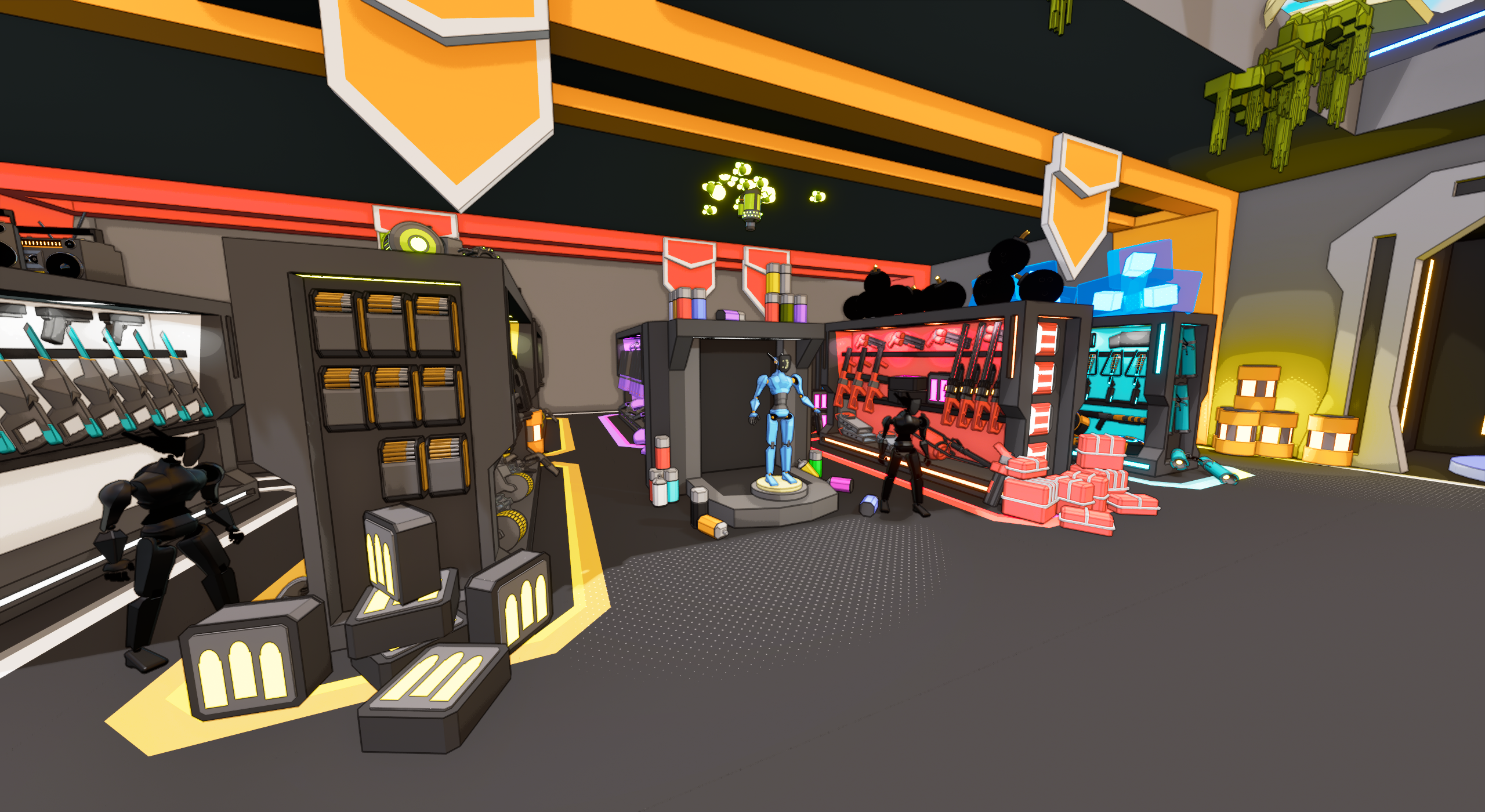
A closer view of the bot customization area and weapon racks.
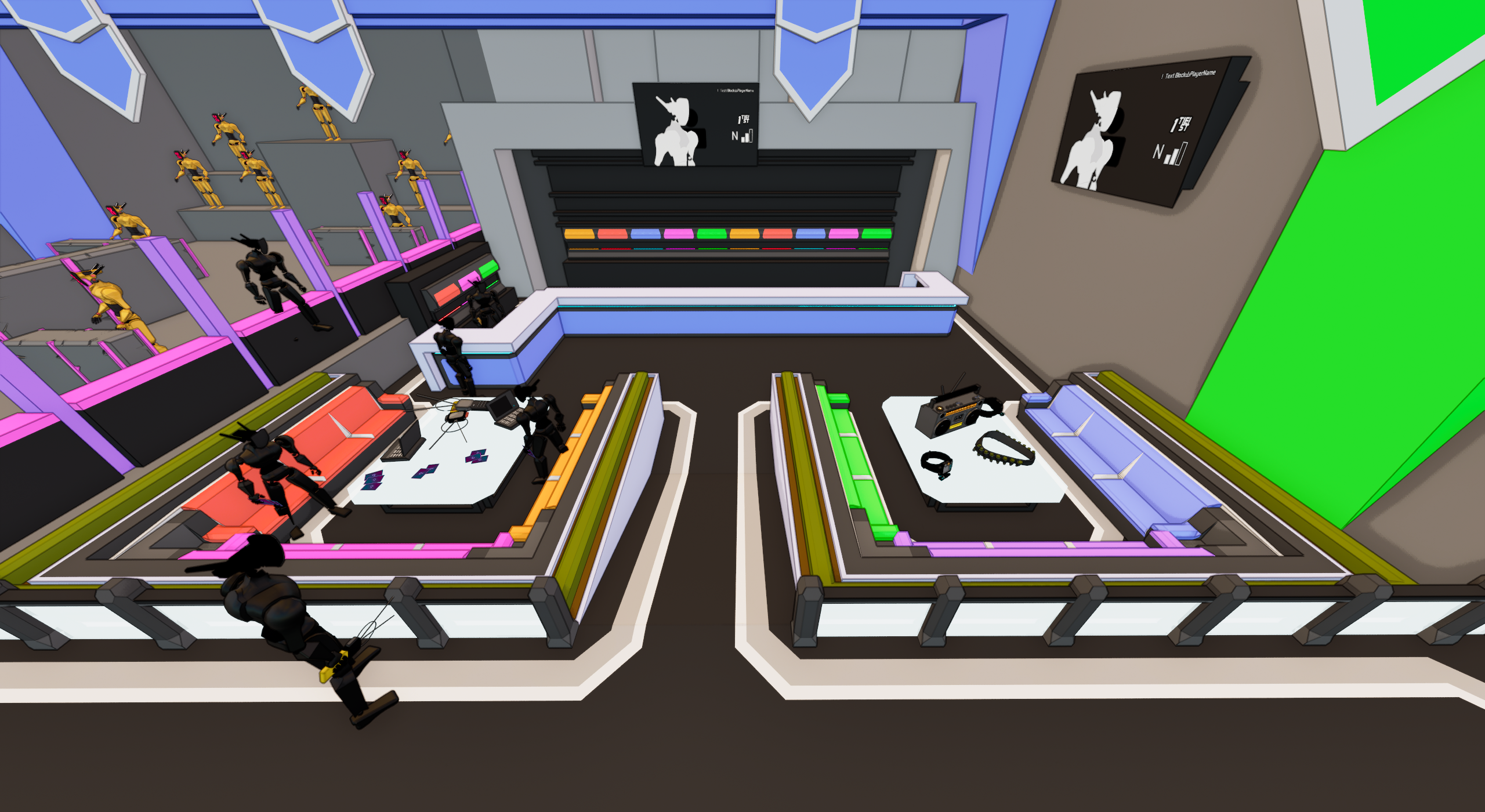
To the right, a lounge area exists where bots will appear playing cards.
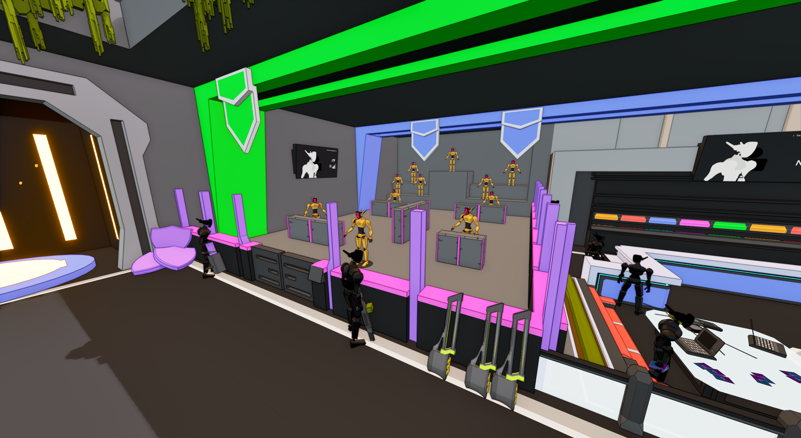
In the back, there is a target practice range where bots will appear to be practicing.

Weapon Design Goals

Weapons in C4 are a key element in various stages of the game. Between players constructing the match, or scavenging around the battlefield, our weapons being distinct and unique was a very important goal. To ensure we had a good variety, we set our goal as 50 unique weapons for the game.
Weapons fit into one of five ammo types, with their other attributes coming from projectile type and ideal range. To ensure we filled different areas with each weapon, we made a chart for our weapon design space and used certain categories to identify where certain ammo types may be lacking or overabundant.
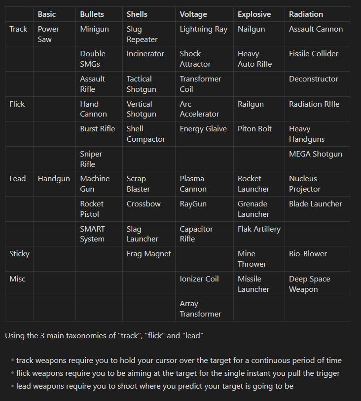
The grid we used of all the game’s weapons to organize and fill holes in weapon designs.
My Contributions
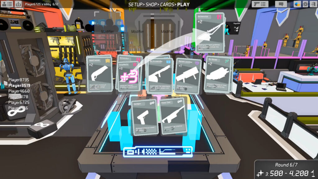
Weapon Cards being played by players to determine the match loadout.
My initial involvement was implementing weapons from our design documents. I implemented the weapons found in each weapon series after 3. (A “Weapon Series” is one weapon of each ammo type). I also aided in reworking the Scrap Blaster, one weapon which was a notable sour-spot for players in the shell weapon’s lineup. Turning it from a simple slow projectile weapon to a bit of a projectile/shotgun hybrid for players to use.
As we planned ahead, I also helped with creating the design concepts for the next 5 weapon series we needed to reach our goal.